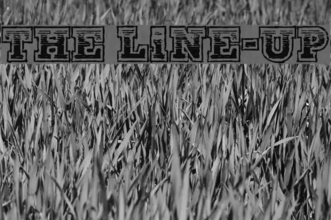
The Line-Up Font

Do you have the right license?
Having the right license means that you protect yourself from negative legal consequences of not getting proper permissions. Make sure you have the right license by purchasing the individual font or to use a tool like Envato where all fonts are commercially licensed automatically.
The Line-Up Description
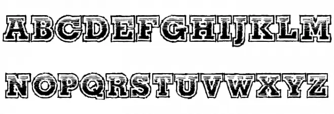
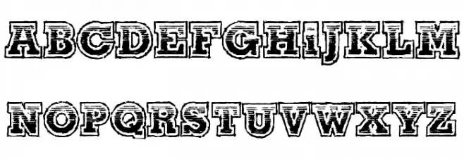
This font features a bold, decorative style with a distinct outline and shadow effect, giving it a three-dimensional appearance. The characters are uppercase and exhibit a rugged, textured look, reminiscent of vintage poster fonts. The design includes intricate detailing within each letter, adding to its visual complexity and appeal. The font's boldness and unique style make it stand out, suitable for eye-catching designs. Its decorative nature suggests a playful yet strong presence, ideal for projects requiring a touch of nostalgia or a bold statement.
A bold, decorative font with a vintage, textured outline and shadow effect.
- Downloads: 129
- ( Fonts by Kevin Christopher - www.kcfonts.com. Personal-use only. For commercial use please contact owner. FREE )
- TheLine-UpDEMO-KCFonts.ttf
- Font: The Line-Up
- Weight: Regular
- Version: Version 1.000 DEMO
- No. of Characters:: 65
- Proposed Projects: Ideal for posters, headlines, branding, and any design needing a bold, vintage touch.
- Category: Decorative/Display
- Bold: Yes
- Italic: No
- Weight: Bold
- Width: Normal
- Character Spacing: Normal
- Contrast: High
- Overall Style: Vintage
- Use Case: Headlines, Logos, Posters
- Encoding Scheme:
- Is Fixed Pitch: No
Glyphs - 0 1 2 3 4 5 6 7 8 9 A B C D E F G H I J K L M N O P Q R S T U V W X Y Z a b c d e f g h i j k l m n o p q r s t u v w x y z
The Line-Up UPPERCASE
The Line-Up LOWERCASE
The Line-Up OTHER CHARS
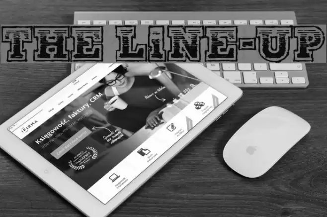
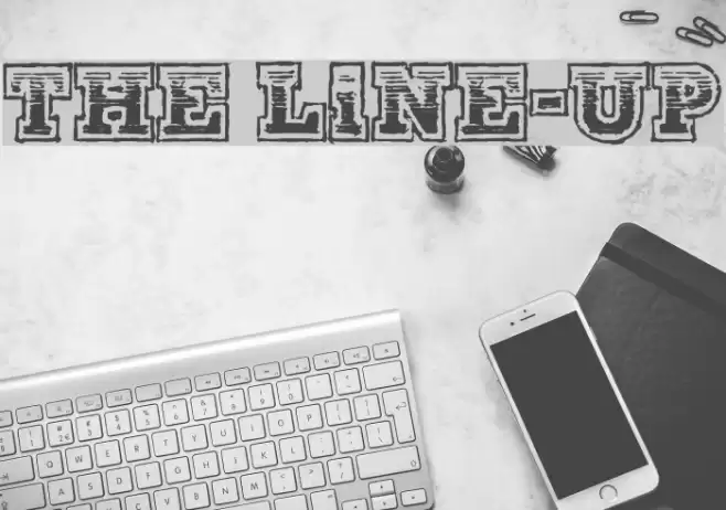
Gallery Examples
Download Free Fonts
Commercial Fonts Fonts
-
 Buy font Theuerdank Fraktur Pro Commercial Fonts
 -
 Buy font Theater Lights JNL Commercial Fonts
 -
 Buy font Theo Handwriting Commercial Fonts