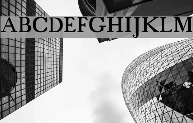
18thCentury Font

18thCentury Description
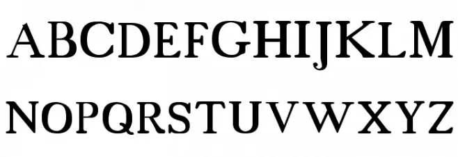
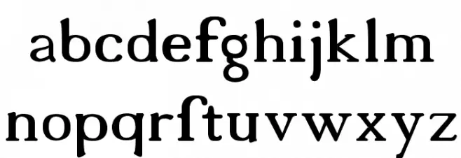
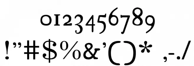
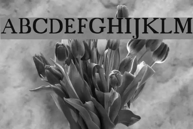
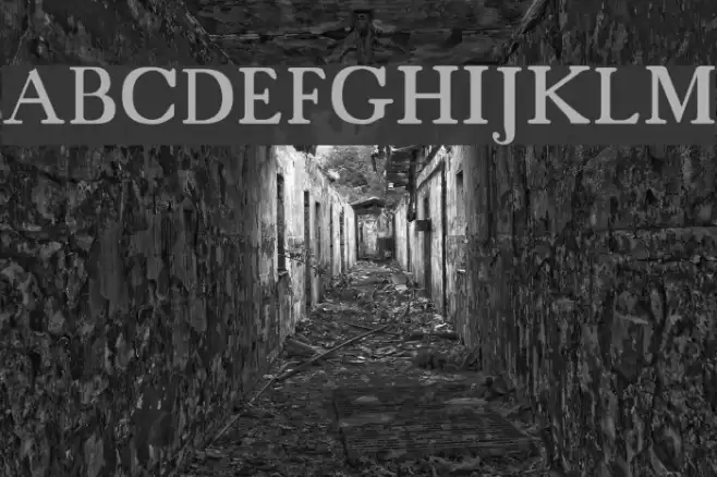
This font exudes a classic elegance reminiscent of the 18th century, characterized by its refined serif design. The uppercase letters are bold and commanding, with a slight curvature that adds a touch of sophistication. The lowercase letters maintain a consistent style, with a graceful flow that enhances readability. Numbers are distinct and well-proportioned, ensuring clarity in any context. Special characters are thoughtfully designed, maintaining the font's overall aesthetic. The font's balance between thick and thin strokes provides a medium contrast, making it suitable for both display and body text.
A classic serif font with elegant curves and medium contrast, ideal for refined designs from Typewriter fonts.
- Downloads: 11,813
- 18cents.ttf
- Font: 18thCentury
- Weight: Regular
- Version: Version Version 1.00
- No. of Characters:: 97
- Proposed Projects: This font is perfect for projects that require a touch of elegance and tradition, such as wedding invitations, historical publications, or luxury branding.
- Category:
- Bold: No
- Italic: No
- Weight: Regular
- Width: Normal
- Character Spacing: Normal
- Contrast: Medium
- Overall Style: Classic
- Use Case: Headlines, Body text, Logos
- Encoding Scheme:
- Is Fixed Pitch: No
Glyphs ! # $ % ( ) * + , - . / 0 1 2 3 4 5 6 7 8 9 : ; = ? @ A B C D E F G H I J K L M N O P Q R S T U V W X Y Z [ ] ^ _
18thCentury UPPERCASE
18thCentury LOWERCASE
18thCentury OTHER CHARS
Gallery Examples
Download Free Fonts
Commercial Fonts Fonts
-
 Buy font Fixed Rounded Cut Commercial Fonts
 -
 Buy font Fixed Square Commercial Fonts
 -
 Buy font Fixed Square Cut Commercial Fonts