Fonts
5th Grade Cursive Font
Description
- 5thgradecursive-2.ttf
- Font: 5th Grade Cursive
- Weight: Regular
- Version: Version Version 2.000 2008 initial release
- No. of Characters:: 119
- Encoding Scheme:
- Is Fixed Pitch: 0
Welcome to the Font Trends page — your destination for discovering which fonts are shaping today’s design landscape. Whether you’re working on a brand refresh, social media visuals, or website UI, following current font trends helps your work feel fresh and relevant.
This collection features the most trending fonts of the season, chosen by designers and creators across the world. Expect to see elegant serifs, minimalist sans serifs, expressive display fonts, and handcrafted scripts that define modern aesthetics in 2025.
Combine your favorite trending typefaces with timeless categories like Modern, Serif, or Handwritten for a balanced and eye-catching design.
-
( Fonts by Apostrophic Lab )
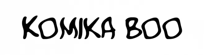
A playful, bold, and cartoonish font with a hand-drawn appearance.
 Download 1313 Downloads@WebFont
 -
( Fonts by Apostrophic Lab )
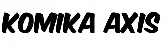
A bold, comic-inspired font with playful, dynamic characters.
![Komika Axis Free Fonts Download]() Download 13219 Downloads@WebFont
Download 13219 Downloads@WebFont -
( Fonts by Apostrophic Lab )
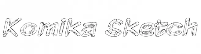
A playful, hand-drawn sketch font with bold, rounded letters and a textured, 3D effect.
![Komika Sketch Free Fonts Download]() Download 530 Downloads@WebFont
Download 530 Downloads@WebFont -
( Fonts by Apostrophic Lab )
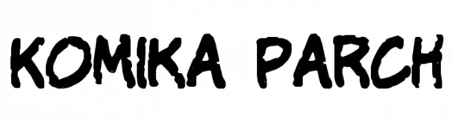
A bold, playful font with a comic book style and hand-drawn feel.
![Komika Parch Free Fonts Download]() Download 674 Downloads@WebFont
Download 674 Downloads@WebFont -
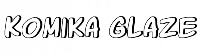
( Fonts by Apostrophic Lab )
A playful, comic-style font with bold, rounded outlines.
![Komika Glaze Free Fonts Download]() Download 667 Downloads@WebFont
Download 667 Downloads@WebFont -
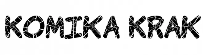
( Fonts by Apostrophic Lab )
A bold, playful font with a shattered glass effect, perfect for creative projects.
![Komika Krak Free Fonts Download]() Download 1144 Downloads@WebFont
Download 1144 Downloads@WebFont -
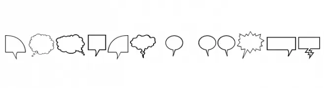
( Fonts by Apostrophic Lab )
Outlined comic speech and thought bubbles in various shapes.
![Komika Bubbles Free Fonts Download]() Download 427 Downloads@WebFont
Download 427 Downloads@WebFont -
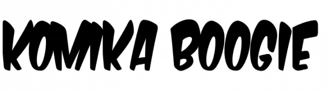
( Fonts by Apostrophic Lab )
A bold, playful font with thick, rounded strokes and a lively appearance.
![Komika Boogie Free Fonts Download]() Download 759 Downloads@WebFont
Download 759 Downloads@WebFont
FAQ — Font Trends
What are the current font trends?
Simplicity, legibility, and warmth dominate: rounded sans serifs, high-contrast serifs, and tasteful retro revivals are everywhere — clean but human.
Which fonts are trending in design right now?
Popular choices include Komika Boo, Komika Axis, Komika Sketch, Komika Parch and Komika Glaze — fonts known for their balance between modern and timeless. They look great on web pages, social content, and packaging, bringing a clean yet expressive feel.
How do I use trending fonts in my projects?
Use one standout display font for titles and pair it with a simple sans serif for body text. This creates contrast without losing readability. Always test how your chosen font trend performs across screen sizes and branding materials before finalizing.
💡 Tip: Refresh key assets every few months with a new trending font to keep visuals sharp and discoverable.