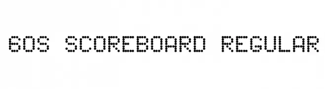
60s Scoreboard Regular Font
60s Scoreboard Regular Description
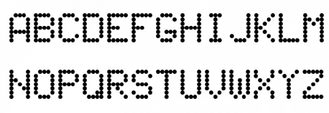
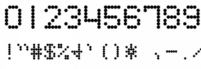
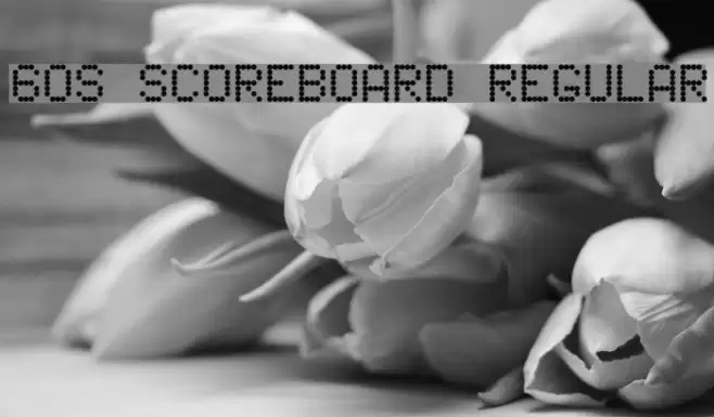
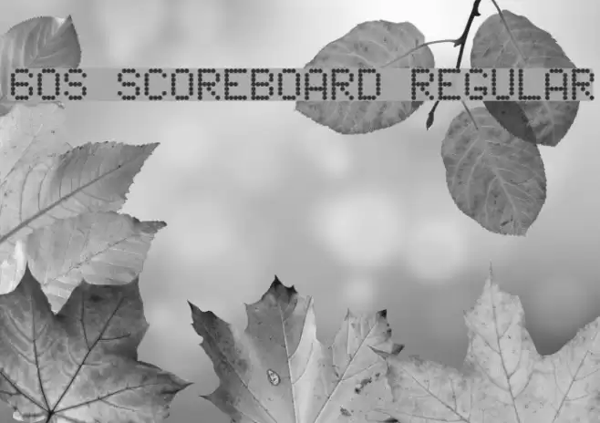
This font features a distinctive dot matrix style, reminiscent of vintage scoreboards and digital displays from the 1960s. Each character is constructed from a grid of evenly spaced dots, creating a retro, technological aesthetic. The uppercase and lowercase letters maintain a consistent height and width, contributing to a uniform appearance. Numbers and special characters follow the same dot pattern, ensuring a cohesive look across all glyphs. The font's geometric precision and nostalgic feel make it ideal for projects that aim to evoke a sense of retro futurism or digital nostalgia.
A dot matrix font with a retro, digital display aesthetic from Futuristic fonts.
- Downloads: 962
- ( Fonts by John Isles FREE )
- 60s Scoreboard.ttf
- Font: 60s Scoreboard Regular
- Weight: Regular
- Version: Version Version 1.0
- No. of Characters:: 227
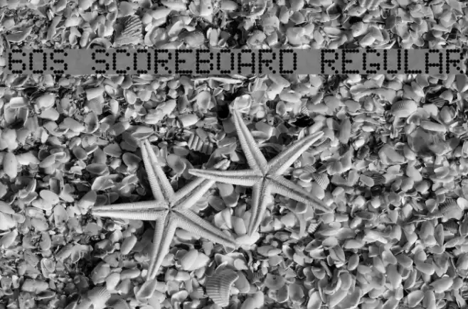
- Proposed Projects: Ideal for retro-themed designs, digital displays, tech-related branding, and vintage-inspired posters.
- Category:
- Bold: No
- Italic: No
- Weight: Regular
- Width: Normal
- Character Spacing: Normal
- Contrast: Low
- Overall Style: Vintage
- Use Case: Logos, Headlines, Digital displays
- Encoding Scheme:
- Is Fixed Pitch: No
Glyphs ! # $ % ( ) * + , - . / 0 1 2 3 4 5 6 7 8 9 : ; = ? @ A B C D E F G H I J K L M N O P Q R S T U V W X Y Z [ ] _ ` a b c d e f g h i j k l m n o p q r s t u v w x y z { | } ~
60s Scoreboard Regular UPPERCASE

60s Scoreboard Regular LOWERCASE
60s Scoreboard Regular OTHER CHARS
Gallery Examples
Commercial Fonts Fonts
-
 Buy font Scoreboard JNL Commercial Fonts
 -
 Buy font Apollonius Regular Commercial Fonts
 -
 Buy font Dinghybats Regular Commercial Fonts