A Dash of Salt Font

A Dash of Salt Description
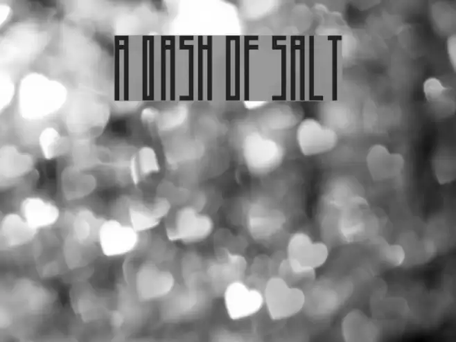
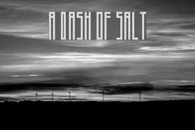
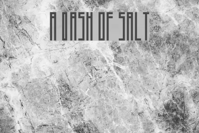
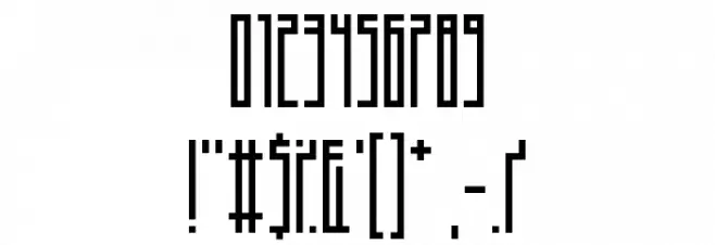
This font features a tall, narrow design with a distinctly modern and geometric aesthetic. The characters are elongated and maintain a consistent vertical alignment, giving it a sleek and sophisticated appearance. The uppercase and lowercase letters share a similar structure, emphasizing uniformity and balance. The numerals and special characters are designed to match the overall style, ensuring a cohesive look across all elements. The font's clean lines and sharp angles make it suitable for contemporary design projects that require a bold and impactful visual presence.
A tall, narrow, and geometric font with a modern aesthetic from Futuristic fonts.
- Downloads: 649
- ( Fonts by Andrew McCluskey - nalgames.com. Personal-use only. For commercial use please contact owner. FREE )
- A Dash of Salt.otf
- Font: A Dash of Salt
- Weight: Regular
- Version: Version 1.00 March 10, 2014, initial release
- No. of Characters:: 98
- Proposed Projects: Ideal for branding, posters, and editorial design where a modern and striking look is desired.
- Category:
- Bold: No
- Italic: No
- Weight: Regular
- Width: Condensed
- Character Spacing: Tight
- Contrast: Low
- Overall Style: Modern
- Use Case: Headlines, Logos
- Encoding Scheme:
- Is Fixed Pitch: No
Glyphs ! # $ % ( ) * + , - . / 0 1 2 3 4 5 6 7 8 9 : ; = ? @ A B C D E F G H I J K L M N O P Q R S T U V W X Y Z [ ] _ ` a b c d e f g h i j k l m n o p q r s t u v w x y z { | } ; fi fl
A Dash of Salt UPPERCASE

A Dash of Salt LOWERCASE
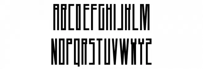
A Dash of Salt OTHER CHARS
Gallery Examples