ATAMA-SERIF__G Font

ATAMA-SERIF__G Description
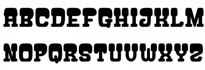
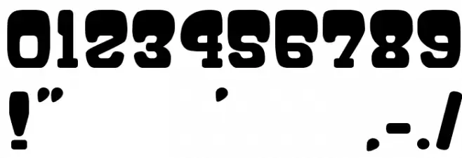
This font features a bold and robust design with thick, block-like serifs that give it a strong and commanding presence. The characters are uniformly wide, with a consistent stroke thickness that adds to its bold appearance. The uppercase letters are particularly striking, with a slight curvature that softens the overall look without compromising its strength. The numbers and special characters maintain the same bold style, ensuring a cohesive look across all text. This font is ideal for making a statement, with its high contrast and solid structure making it stand out in any design.
A bold, blocky serif font with strong, consistent strokes and high contrast from Uncategorized fonts.
- Downloads: 306
- ( Fonts by Goma Shin - Shintarou Nakayama www.geocities.jp/gomarice_font/ FREE )
- gomarice_atama_serif.ttf
- Font: ATAMA-SERIF__G
- Weight: Regular
- Version: Version Ver.1 Gomarice Font 2010/04/21
- No. of Characters:: 221
- Proposed Projects: Ideal for posters, headlines, branding, and any design that requires a strong visual impact.
- Category:
- Bold: Yes
- Italic: No
- Weight: Bold
- Width: Normal
- Character Spacing: Normal
- Contrast: High
- Overall Style: Modern
- Use Case: Headlines, Logos, Posters
- Encoding Scheme:
- Is Fixed Pitch: No
Glyphs ! # $ % ( ) * + , - . / 0 1 2 3 4 5 6 7 8 9 : ; = ? @ A B C D E F G H I J K L M N O P Q R S T U V W X Y Z [ ] ^ _ ` a b c d e f g h i j k l m n o p q r s t u v w x y z { | } ~
ATAMA-SERIF__G UPPERCASE
ATAMA-SERIF__G LOWERCASE

ATAMA-SERIF__G OTHER CHARS
Gallery Examples