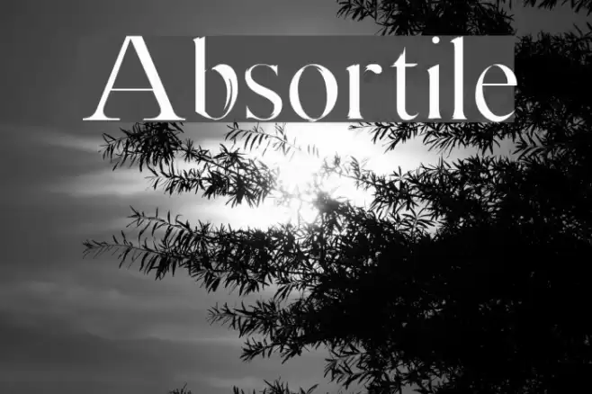
Absortile Font

Absortile Description
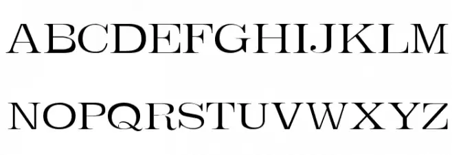
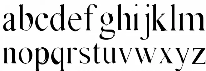
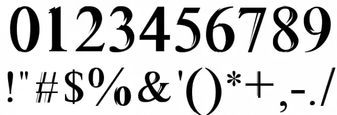
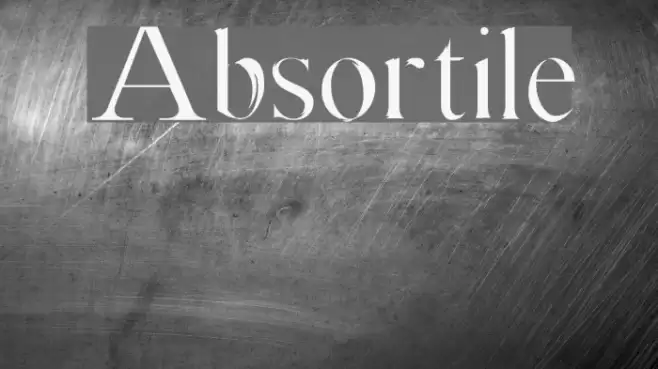
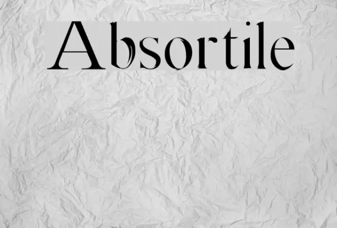
This font features a classic serif style with elegant, thin strokes and high contrast between thick and thin lines. The uppercase letters are tall and stately, with sharp serifs that give a sense of sophistication. The lowercase letters maintain a consistent style, with rounded forms and delicate curves. Numbers are bold and clear, making them easily readable. Special characters are designed to match the overall aesthetic, providing a cohesive look across all glyphs. The font exudes a timeless elegance, suitable for formal and refined applications.
A classic serif font with high contrast and elegant, sharp serifs from Uncategorized fonts.
- Downloads: 260
- ( Malre - David Masson Alalire - www.facebook.com/Community-Search-146103155534356/ FREE )
- Absortile.ttf
- Font: Absortile
- Weight: Medium
- Version: Version Version 001.000
- No. of Characters:: 253
- Proposed Projects: Ideal for use in editorial design, book covers, formal invitations, and luxury branding.
- Category:
- Bold: No
- Italic: No
- Weight: Regular
- Width: Normal
- Character Spacing: Normal
- Contrast: High
- Overall Style: Classic
- Use Case: Headlines, Body text, Logos
- Encoding Scheme:
- Is Fixed Pitch: No
Glyphs ! # $ % ( ) * + , - . / 0 1 2 3 4 5 6 7 8 9 : ; = ? @ A B C D E F G H I J K L M N O P Q R S T U V W X Y Z [ ] ^ _ ` a b c d e f g h i j k l m n o p q r s t u v w x y z { | } ~
Absortile UPPERCASE
Absortile LOWERCASE
Absortile OTHER CHARS
Gallery Examples
Download Free Fonts
-
 Buy font Amika Light Commercial Fonts
 -
 Buy font Amika Light Italic Commercial Fonts
 -
 Buy font Amika Book Commercial Fonts