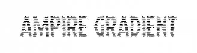
Ampire Gradient Font
Ampire Gradient Description
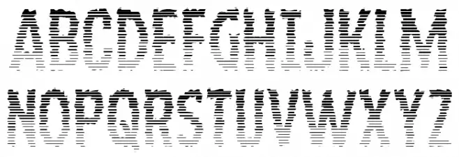
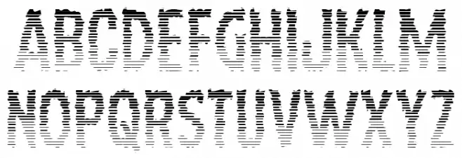
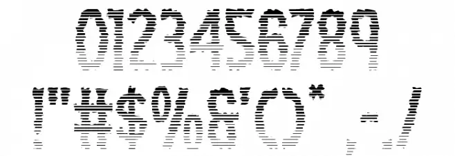
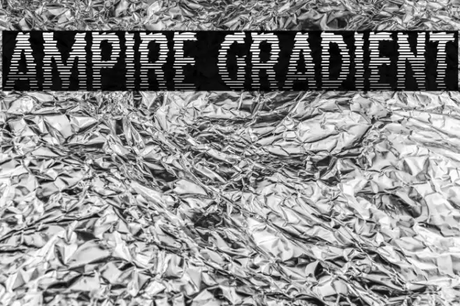
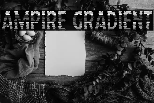
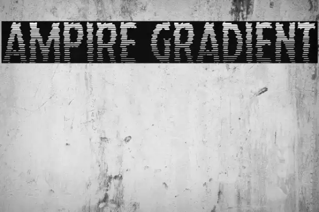
This font features a unique gradient effect created by horizontal lines that vary in density, giving each character a dynamic and textured appearance. The uppercase and lowercase letters maintain a consistent width, while the numbers and special characters follow the same stylistic approach. The design is bold and eye-catching, making it ideal for projects that require a modern and artistic touch. The gradient effect adds depth and movement, making it suitable for digital media and print where a striking visual impact is desired.
A bold, gradient-style font with horizontal line textures for a dynamic look from Uncategorized fonts.
- Downloads: 60
- ( Fonts by Daniel Zadorozny - www.iconian.com - Personal-use only. For commercial use please contact owner. FREE )
- ampiregrad.ttf
- Font: Ampire Gradient
- Weight: Regular
- Version: Version Version 1.0; 2019
- No. of Characters:: 221
- Proposed Projects: Ideal for digital media, posters, album covers, and branding that require a modern and artistic flair.
- Category:
- Bold: Yes
- Italic: No
- Weight: Bold
- Width: Normal
- Character Spacing: Normal
- Contrast: Medium
- Overall Style: Modern
- Use Case: Headlines, Logos, Posters
- Encoding Scheme:
- Is Fixed Pitch: No
Glyphs ! # $ % ( ) * + , - . / 0 1 2 3 4 5 6 7 8 9 : ; = ? @ A B C D E F G H I J K L M N O P Q R S T U V W X Y Z [ ] ^ _ ` a b c d e f g h i j k l m n o p q r s t u v w x y z { | } ~
Ampire Gradient UPPERCASE
Ampire Gradient LOWERCASE
Ampire Gradient OTHER CHARS
Gallery Examples
-
 Buy font Gibon Bold Fill Gradient Commercial Fonts
 -
 Buy font Balboa Plus Gradient Commercial Fonts
 -
 Buy font Remix Typewriter Gradient Commercial Fonts