Fonts
An Unfortunate Event DeWarped Font
Description
- ANUNEDW_.TTF
- Font: An Unfortunate Event DeWarped
- Weight: Regular
- Version: Version 0.7
- No. of Characters:: 679
- Encoding Scheme:
- Is Fixed Pitch: 0
Welcome to the Font Trends page — your destination for discovering which fonts are shaping today’s design landscape. Whether you’re working on a brand refresh, social media visuals, or website UI, following current font trends helps your work feel fresh and relevant.
This collection features the most trending fonts of the season, chosen by designers and creators across the world. Expect to see elegant serifs, minimalist sans serifs, expressive display fonts, and handcrafted scripts that define modern aesthetics in 2025.
Combine your favorite trending typefaces with timeless categories like Modern, Serif, or Handwritten for a balanced and eye-catching design.
-
( Fonts by ShyFonts )
A bold, modern, and geometric font with an extended width, perfect for headlines.
 Download 558 Downloads@WebFont
 -
( Fonts by Mr Fisk - Mike Larsson - fontorama.net )
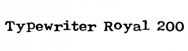
A vintage typewriter-style font with a slightly distressed look.
![Typewriter Royal 200 Free Fonts Download]() Download 1056 Downloads@WebFont
Download 1056 Downloads@WebFont -
![Octoville Free Fonts Download]() Download 849 Downloads@WebFont
Download 849 Downloads@WebFont -
( Fonts by Dibujado )
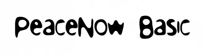
A playful, organic font with rounded, flowing shapes and a whimsical charm.
![PeaceNow Basic Free Fonts Download]() Download 259 Downloads@WebFont
Download 259 Downloads@WebFont -
![Baumarkt BoldItalic Free Fonts Download]() Download 195 Downloads@WebFont
Download 195 Downloads@WebFont -
![Parasight Free Fonts Download]() Download 172 Downloads@WebFont
Download 172 Downloads@WebFont -
![Luxembourg Regular Free Fonts Download]() Download 333 Downloads@WebFont
Download 333 Downloads@WebFont -
( Fonts by www.aenigmafonts.com )
A bold, pixelated font with a retro digital aesthetic.
![Upheaval TT -BRK- Free Fonts Download]() Download 983 Downloads@WebFont
Download 983 Downloads@WebFont

FAQ — Font Trends
What are the current font trends?
Simplicity, legibility, and warmth dominate: rounded sans serifs, high-contrast serifs, and tasteful retro revivals are everywhere — clean but human.
Which fonts are trending in design right now?
Popular choices include SF Proverbial Gothic Extended, Typewriter Royal 200, Octoville, PeaceNow Basic and Baumarkt BoldItalic — fonts known for their balance between modern and timeless. They look great on web pages, social content, and packaging, bringing a clean yet expressive feel.
How do I use trending fonts in my projects?
Use one standout display font for titles and pair it with a simple sans serif for body text. This creates contrast without losing readability. Always test how your chosen font trend performs across screen sizes and branding materials before finalizing.
💡 Tip: Refresh key assets every few months with a new trending font to keep visuals sharp and discoverable.