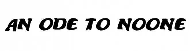
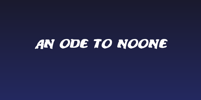
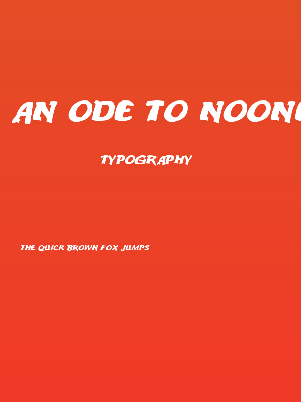
An ode to noone Font
✎ Decorative
📄 PostScript
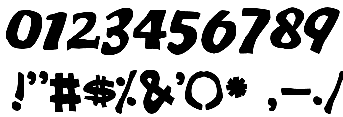
🔢 102 chars
⬇ 510
✅ Free
✅ Web Font
An ode to noone Description
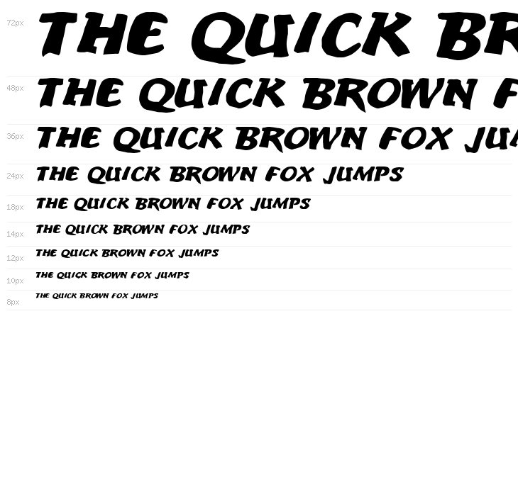
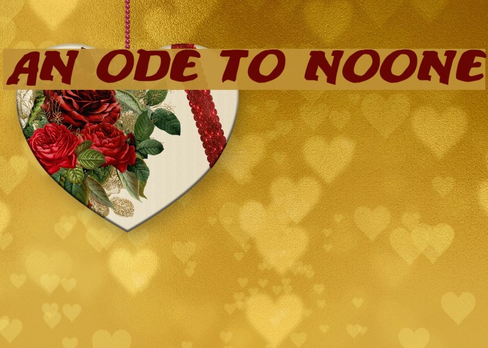
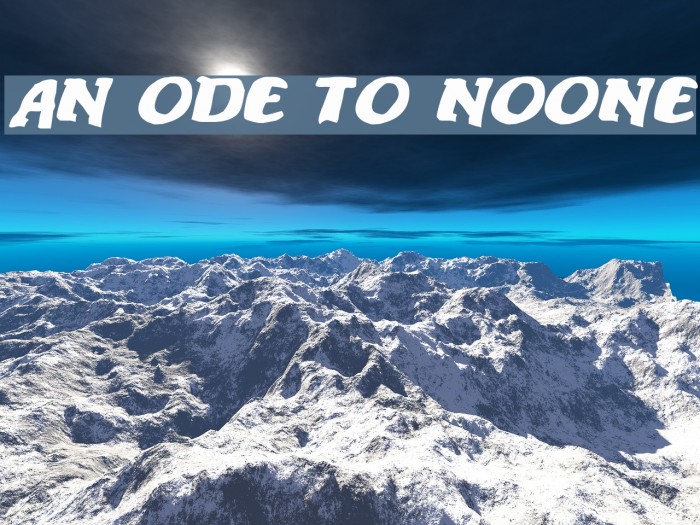
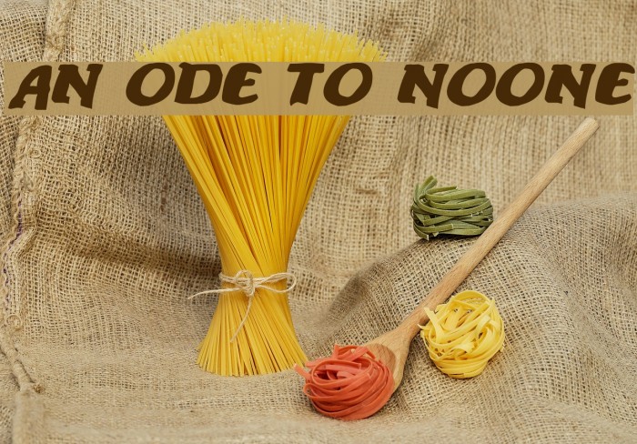
This font features a bold and dynamic style with a strong presence. The characters are slightly slanted, giving a sense of motion and energy. The strokes are thick and consistent, providing a robust and impactful appearance. The uppercase and lowercase letters maintain a uniform style, enhancing readability while still offering a unique flair. The numbers and special characters are designed to match the overall aesthetic, ensuring cohesion across all elements. This font is ideal for projects that require a bold statement, combining both modern and classic elements.
Fonts by Jacob Fisher - www.pizzadude.dk
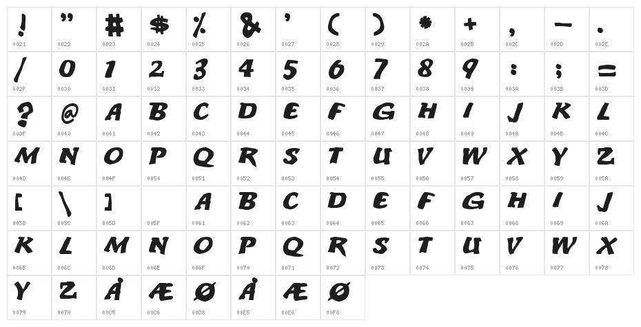
This font includes 102 characters. Click on any character to see details.
Numbers & Symbols
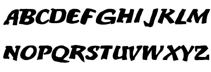
AN-ODE-TO-NOONE UPPERCASE

AN-ODE-TO-NOONE LOWERCASE
AN-ODE-TO-NOONE OTHER CHARS
GALLERY EXAMPLES
Similar Free Fonts
Similar Commercial Fonts


Business Card

Social Header
Logo
Poster
Information
| Name | An ode to noone |
| TTF Name | ANODETON.TTF |
| Font Family | 1 |
| Style | 1 |
| Format | PostScript (.ttf) |
| File | An-ode-to-noone.zip |
| Weight | Regular |
| Version | Version www.pizzadude.cjb.net |
| No. of Characters: | 102 |
| Downloads | 510 |
| Added | 2009-05-27 |
| Updated | 2024-12-06 |
| Categories | Decorative |
| Bold | Yes |
| Italic | No |
| Width | Normal |
| Character Spacing | Monospaced |
| Contrast | Low |
| Overall Style | Modern |
| Use Case | Headlines, Logos, Posters |
| Proposed Projects | Perfect for branding, posters, headlines, and any design needing a strong, energetic typeface. |
| Is Fixed Pitch | No |
| Web Font | Available |
| License | Free for personal use |
Fonts by Jacob Fisher - www.pizzadude.dk
Tags
💻 Windows
- Extract ZIP
- Right-click .ttf -> Install
🍎 macOS
- Extract ZIP
- Double-click .ttf -> Install Font
An ode to noone
Free · PostScript
| Name | An ode to noone |
| Type | PostScript |
| Characters | 102 |
| Downloads | 510 |
| Added | 2009-05-27 |
| Web Font | Available |
| Author | Fonts by Jacob Fisher - www.pizzadude.dk |
| Categories | Decorative |