Fonts
Astron Boy Italic Font
Description
- astronbi.ttf
- Font: Astron Boy Italic
- Weight: Italic
- Version: Version Version 1.0; 2000; initial release
- No. of Characters:: 296
- Encoding Scheme:
- Is Fixed Pitch: 0
Welcome to the Font Trends page — your destination for discovering which fonts are shaping today’s design landscape. Whether you’re working on a brand refresh, social media visuals, or website UI, following current font trends helps your work feel fresh and relevant.
This collection features the most trending fonts of the season, chosen by designers and creators across the world. Expect to see elegant serifs, minimalist sans serifs, expressive display fonts, and handcrafted scripts that define modern aesthetics in 2025.
Combine your favorite trending typefaces with timeless categories like Modern, Serif, or Handwritten for a balanced and eye-catching design.
-
 Download 452 Downloads@WebFont
 -
![Opticon One1 Free Fonts Download]() Download 1039 Downloads@WebFont
Download 1039 Downloads@WebFont -
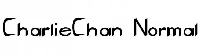
![CharlieChan Normal Free Fonts Download]() Download 898 Downloads
Download 898 Downloads -
( Fonts by Graham Meade - GemFonts )
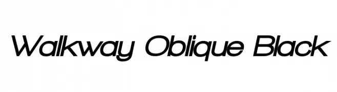
A modern, oblique font with consistent stroke thickness and a sleek, dynamic appearance.
![Walkway Oblique Black Free Fonts Download]() Download 700 Downloads@WebFont
Download 700 Downloads@WebFont -
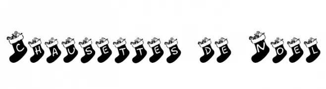
![Chausettes de Noel Free Fonts Download]() Download 703 Downloads@WebFont
Download 703 Downloads@WebFont -
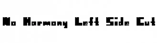
![No Harmony Left Side Cut Free Fonts Download]() Download 179 Downloads@WebFont
Download 179 Downloads@WebFont -
( Fonts by Jacob Fisher - www.pizzadude.dk )
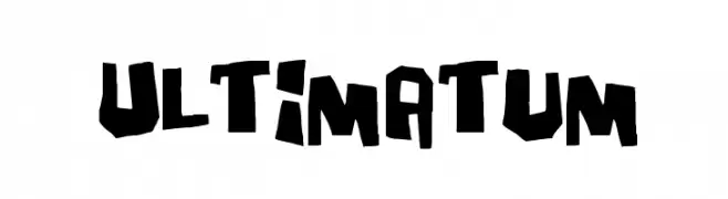
A bold, jagged, and dynamic font with a hand-drawn, edgy style.
![Ultimatum Free Fonts Download]() Download 9703 Downloads@WebFont
Download 9703 Downloads@WebFont -
( Fonts by Jacob Fisher - www.pizzadude.dk )
A playful, hand-drawn font with a whimsical and casual style.
![Mouthful of beer Free Fonts Download]() Download 401 Downloads@WebFont
Download 401 Downloads@WebFont


FAQ — Font Trends
What are the current font trends?
Simplicity, legibility, and warmth dominate: rounded sans serifs, high-contrast serifs, and tasteful retro revivals are everywhere — clean but human.
Which fonts are trending in design right now?
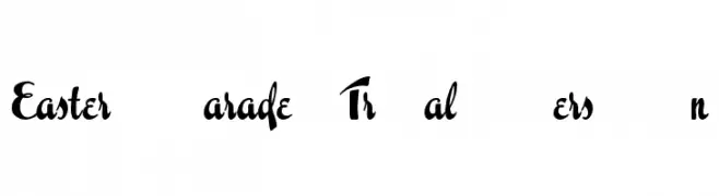
Popular choices include Easter Parade Trial Version, Opticon One1, CharlieChan Normal, Walkway Oblique Black and Chausettes de Noel — fonts known for their balance between modern and timeless. They look great on web pages, social content, and packaging, bringing a clean yet expressive feel.
How do I use trending fonts in my projects?
Use one standout display font for titles and pair it with a simple sans serif for body text. This creates contrast without losing readability. Always test how your chosen font trend performs across screen sizes and branding materials before finalizing.
💡 Tip: Refresh key assets every few months with a new trending font to keep visuals sharp and discoverable.