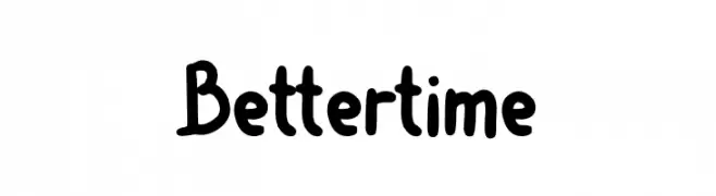
Better time Font
Better time Description
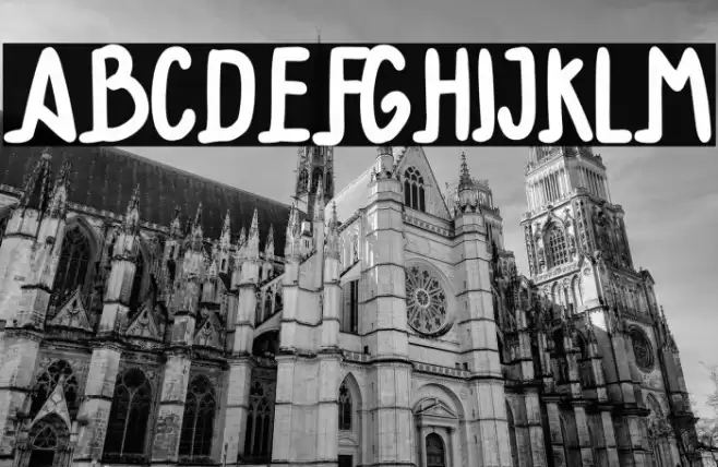
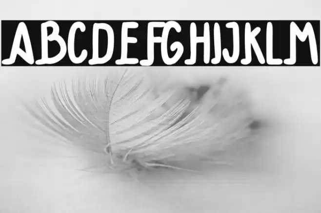
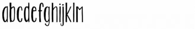
This playful and bold font features a handwritten style with rounded edges and a casual, friendly appearance. The letters are slightly irregular, adding a whimsical touch that makes it stand out. The uppercase and lowercase characters maintain a consistent style, with a smooth flow and a sense of movement. The numbers and special characters are designed to match the overall aesthetic, ensuring a cohesive look across all text elements. This font is perfect for projects that require a personal, approachable feel.
A playful, handwritten font with rounded edges and a whimsical style from Uncategorized fonts.
- Downloads: 182
- ( Fonts by Pidco Art - Hindro Cholis - Personal-use only. For commercial use please contact owner. FREE )
- Font: Better time
- Weight:
- Version:
- No. of Characters:: over 20
- Proposed Projects: Ideal for children's books, greeting cards, playful branding, and social media graphics.
- Category:
- Bold: Yes
- Italic: No
- Weight: Bold
- Width: Normal
- Character Spacing: Normal
- Contrast: Low
- Overall Style: Playful
- Use Case: Headlines, Logos, Informal Text
- Encoding Scheme:
- Is Fixed Pitch: No
Glyphs
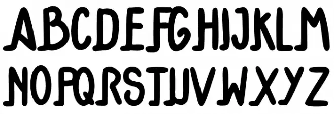
Better time UPPERCASE
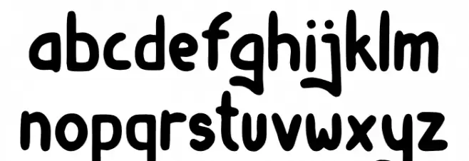
Better time LOWERCASE
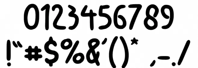
Better time OTHER CHARS
Gallery Examples

Download
182 Downloads
-
 Buy font KG Two Is Better Than One Commercial Fonts
 -
 Buy font Better Together Caps Commercial Fonts
 -
 Buy font Better Together Script Commercial Fonts