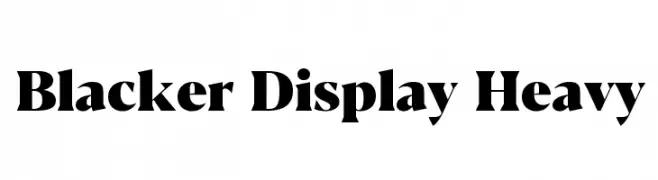
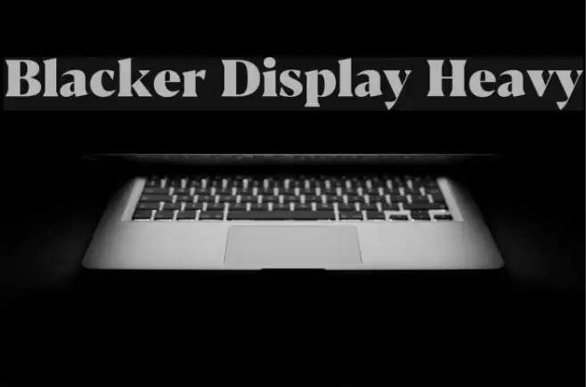
Blacker Display Heavy Font
Blacker Display Heavy Description
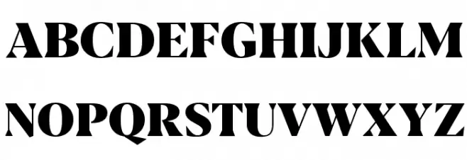
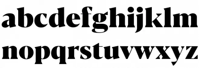
This font exhibits a bold and commanding presence, characterized by its thick, heavy strokes and high contrast between thick and thin lines. The serifs are pronounced and sharp, giving it a strong, authoritative feel. The uppercase letters are particularly striking, with a wide stance and a sense of grandeur. The lowercase letters maintain the same boldness, ensuring readability while retaining the font's dramatic flair. The numerals and special characters are equally robust, making them suitable for impactful displays. Overall, this font is designed to capture attention and convey a sense of power and sophistication.
A bold, high-contrast serif font with a commanding presence from Uncategorized fonts.
- Downloads: 290
- ( Zetafonts - www.zetafonts.com FREE )
- Blacker-Display-Heavy-trial.ttf
- Font: Blacker Display Heavy
- Weight: Heavy
- Version: Version Version 1.000
- No. of Characters:: 632
- Proposed Projects: Ideal for headlines, branding, posters, and any project requiring a strong visual impact.
- Category:
- Bold: Yes
- Italic: No
- Weight: Bold
- Width: Normal
- Character Spacing: Normal
- Contrast: High
- Overall Style: Modern
- Use Case: Headlines, Logos
- Encoding Scheme:
- Is Fixed Pitch: No
Glyphs ! # $ % ( ) * + , - . / 0 1 2 3 4 5 6 7 8 9 : ; = ? @ A B C D E F G H I J K L M N O P Q R S T U V W X Y Z [ ] ^ _ ` a b c d e f g h i j k l m n o p q r s t u v w x y z { | } ~
Blacker Display Heavy UPPERCASE
Blacker Display Heavy LOWERCASE
Blacker Display Heavy OTHER CHARS

Gallery Examples


-
 Buy font Blacker Pro Text Bold Commercial Fonts
 -
 Buy font Blacker Pro Titling Diamond Bold Commercial Fonts
 -
 Buy font Blacker Pro Titling Diamond Extrabold Commercial Fonts