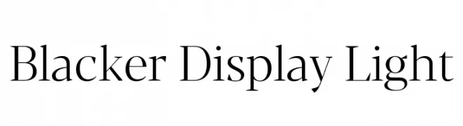
Blacker Display Light Font
Blacker Display Light Description
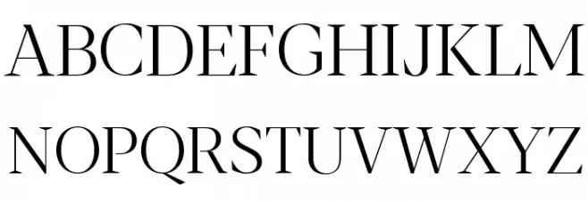
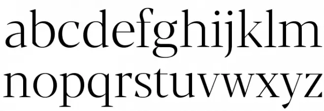
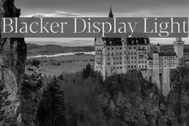
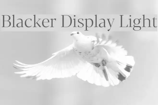
This font exhibits a refined and elegant serif style, characterized by its thin, elongated strokes and high contrast between thick and thin lines. The uppercase letters are tall and commanding, while the lowercase letters maintain a balanced and harmonious appearance. The serifs are sharp and pronounced, adding a touch of sophistication. The numerals are consistent with the overall style, offering clarity and readability. Special characters are designed with the same attention to detail, ensuring a cohesive look across all glyphs.
A refined serif font with high contrast and elegant, elongated strokes from Uncategorized fonts.
- Downloads: 459
- ( Zetafonts - www.zetafonts.com FREE )
- Blacker-Display-Light-trial.ttf
- Font: Blacker Display Light
- Weight: Light
- Version: Version Version 1.000
- No. of Characters:: 632
- Proposed Projects: Ideal for luxury branding, editorial design, and high-end packaging where elegance and readability are paramount.
- Category:
- Bold: No
- Italic: No
- Weight: Light
- Width: Normal
- Character Spacing: Normal
- Contrast: High
- Overall Style: Classic
- Use Case: Headlines, Body text, Logos
- Encoding Scheme:
- Is Fixed Pitch: No
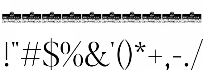
Glyphs ! # $ % ( ) * + , - . / 0 1 2 3 4 5 6 7 8 9 : ; = ? @ A B C D E F G H I J K L M N O P Q R S T U V W X Y Z [ ] ^ _ ` a b c d e f g h i j k l m n o p q r s t u v w x y z { | } ~
Blacker Display Light UPPERCASE
Blacker Display Light LOWERCASE
Blacker Display Light OTHER CHARS
Gallery Examples

-
 Buy font Blacker Pro Text Bold Commercial Fonts
 -
 Buy font Blacker Pro Titling Diamond Bold Commercial Fonts
 -
 Buy font Blacker Pro Titling Diamond Extrabold Commercial Fonts