Blacker Display Regular Font

Blacker Display Regular Description
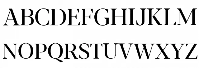
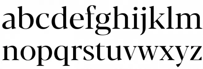
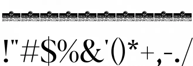
This font exhibits a bold and commanding presence with its high contrast between thick and thin strokes, making it ideal for impactful headlines and titles. The serif design is elegant and sophisticated, with sharp, angular serifs that add a touch of modernity to its classic roots. The uppercase letters are tall and stately, while the lowercase letters maintain a balanced and harmonious appearance. The numerals are clear and distinct, ensuring readability. Special characters are designed with the same attention to detail, providing a cohesive look across all glyphs.
A bold, high-contrast serif font with a modern twist on classic elegance from Uncategorized fonts.
- Downloads: 202
- ( Zetafonts - www.zetafonts.com FREE )
- Blacker-Display-Regular-trial.ttf
- Font: Blacker Display Regular
- Weight: Regular
- Version: Version Version 1.000
- No. of Characters:: 632
- Proposed Projects: Ideal for magazine covers, luxury branding, editorial design, and high-end product packaging.
- Category:
- Bold: Yes
- Italic: No
- Weight: Bold
- Width: Normal
- Character Spacing: Normal
- Contrast: High
- Overall Style: Modern
- Use Case: Headlines, Logos
- Encoding Scheme:
- Is Fixed Pitch: No
Glyphs ! # $ % ( ) * + , - . / 0 1 2 3 4 5 6 7 8 9 : ; = ? @ A B C D E F G H I J K L M N O P Q R S T U V W X Y Z [ ] ^ _ ` a b c d e f g h i j k l m n o p q r s t u v w x y z { | } ~
Blacker Display Regular UPPERCASE
Blacker Display Regular LOWERCASE
Blacker Display Regular OTHER CHARS
Gallery Examples


-
 Buy font Blacker Pro Text Bold Commercial Fonts
 -
 Buy font Blacker Pro Titling Diamond Bold Commercial Fonts
 -
 Buy font Blacker Pro Titling Diamond Extrabold Commercial Fonts