Blog the Impaler Caps Heavy Font

Blog the Impaler Caps Heavy Description
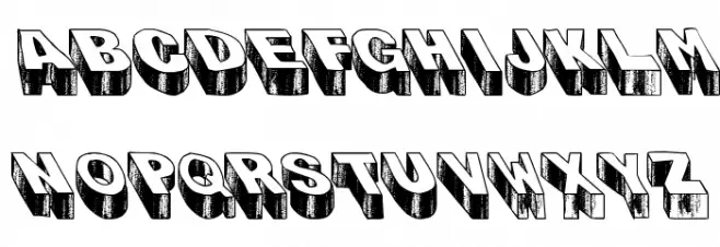
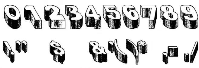
This font features a bold, three-dimensional design with a vintage comic book aesthetic. Each character is heavily stylized with thick outlines and shadowing that gives a sense of depth and weight. The uppercase letters are particularly striking, with a blocky, robust appearance that commands attention. The numbers and special characters maintain this bold, shadowed style, ensuring consistency across all glyphs. The overall look is both playful and impactful, making it ideal for projects that require a strong visual presence.
A bold, 3D vintage-style font with heavy outlines and shadowing from Uncategorized fonts.
- Downloads: 200
- ( Fonts by Kirk Shelton - www.kirkshelton.com FREE )
- Blog The Impaler_capsheavy.ttf
- Font: Blog the Impaler Caps Heavy
- Weight: Regular
- Version: Version 1.00 January 26, 2009, initial release
- No. of Characters:: 97
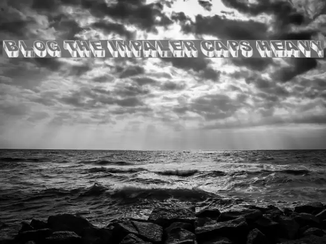
- Proposed Projects: Ideal for comic book titles, retro-themed posters, eye-catching headlines, and branding that requires a bold statement.
- Category:
- Bold: Yes
- Italic: No
- Weight: Bold
- Width: Normal
- Character Spacing: Normal
- Contrast: High
- Overall Style: Vintage
- Use Case: Headlines, Logos, Posters
- Encoding Scheme:
- Is Fixed Pitch: No
Glyphs ! # $ % ( ) * , - . / 0 1 2 3 4 5 6 7 8 9 : ; = ? @ A B C D E F G H I J K L M N O P Q R S T U V W X Y Z [ ] ^ _ ` a b c d e f g h i j k l m n o p q r s t u v w x y z { | } ~ ;
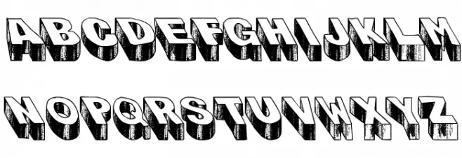
Blog the Impaler Caps Heavy UPPERCASE
Blog the Impaler Caps Heavy LOWERCASE
Blog the Impaler Caps Heavy OTHER CHARS
Gallery Examples


Download Free Fonts
Commercial Fonts Fonts
-
 Buy font Blog Script Light Commercial Fonts
 -
 Buy font Blog Script Commercial Fonts
 -
 Buy font AT Move Bloggy Commercial Fonts