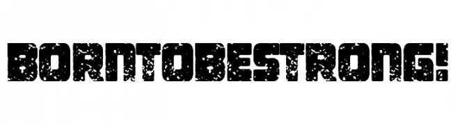
Born To be Strong! Font
Born To be Strong! Description
This font features a bold, distressed style with a rugged texture that gives it a worn, vintage appearance. The characters are blocky and robust, with a consistent thickness throughout, creating a strong visual impact. The distressed effect is applied uniformly across all characters, adding a sense of age and toughness. This font is ideal for projects that require a gritty, industrial look, such as posters, logos, or branding for products that emphasize strength and durability. The uppercase and lowercase letters maintain a uniform height, enhancing the boldness and readability of the text. The numbers and special characters are designed with the same distressed texture, ensuring a cohesive look across all elements.
A bold, distressed font with a rugged, vintage appearance from Uncategorized fonts.
- Downloads: 97
- ( Fonts by Woodcutter Manero - http://www.woodcutter.es - Personal-use only. For commercial use please contact owner. FREE )
- Font: Born To be Strong!
- Weight:
- Version:
- No. of Characters:: over 20
- Proposed Projects: Ideal for posters, logos, branding, and any design requiring a gritty, industrial look.
- Category:
- Bold: Yes
- Italic: No
- Weight: Bold
- Width: Normal
- Character Spacing: Normal
- Contrast: Low
- Overall Style: Vintage
- Use Case: Headlines, Logos
- Encoding Scheme:
- Is Fixed Pitch: No
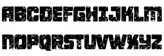
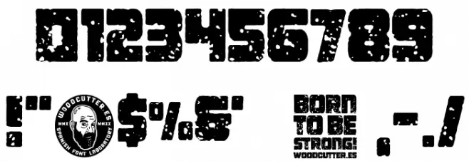
Glyphs
Born To be Strong! UPPERCASE

Born To be Strong! LOWERCASE
Born To be Strong! OTHER CHARS
Gallery Examples
-
 Buy font Bornholm Tejn Low Bold Commercial Fonts
 -
 Buy font Bornholm Tejn Low Commercial Fonts
 -
 Buy font Natural Born Designer Commercial Fonts