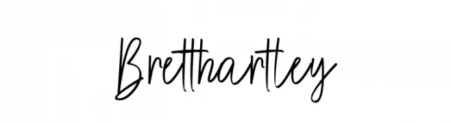
Brett hartley Font
Brett hartley Description
This font features a casual, handwritten style with a smooth and flowing appearance. The uppercase letters are tall and slightly narrow, while the lowercase letters maintain a consistent height, adding to the font's readability. The strokes are moderately thick, providing a balanced weight that is neither too bold nor too light. The characters are well-spaced, offering a clean and uncluttered look. This font is versatile, suitable for various design projects that require a personal and approachable touch.
A casual, handwritten font with smooth, flowing strokes and balanced weight from Uncategorized fonts.
- Downloads: 144
- ( Fonts by Brett Hartley Script FREE )
- Font: Brett hartley
- Weight:
- Version:
- No. of Characters:: over 20
- Proposed Projects: Ideal for greeting cards, personal branding, social media graphics, and invitations.
- Category:
- Bold: No
- Italic: No
- Weight: Regular
- Width: Normal
- Character Spacing: Normal
- Contrast: Medium
- Overall Style: Casual
- Use Case: Logos, Headlines, Invitations
- Encoding Scheme:
- Is Fixed Pitch: No
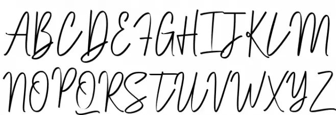
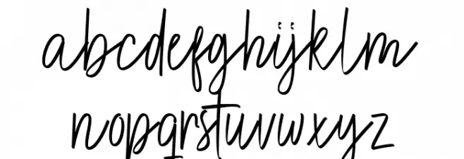
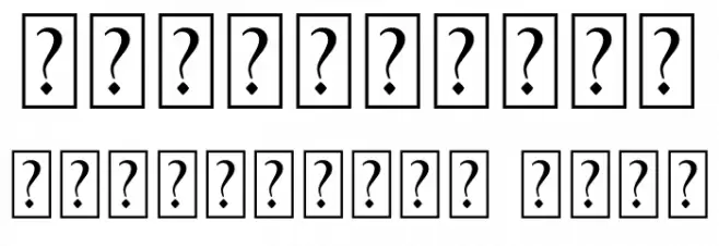
Glyphs
Brett hartley UPPERCASE
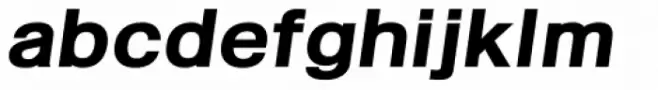
Brett hartley LOWERCASE
Brett hartley OTHER CHARS
Gallery Examples


Download
144 Downloads
-
 Buy font Kropotkin Std 35 Expanded Bold Oblique Commercial Fonts
 -
 Buy font Kropotkin Std 24 Condensed Regular Oblique Commercial Fonts
 -
 Buy font Kropotkin Std 12 Expanded Light Commercial Fonts