CARPE DIEM MIDDLE demo Font

CARPE DIEM MIDDLE demo Description
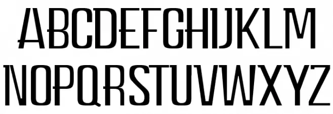
This font features a modern and sleek design with tall, narrow characters that exhibit a strong vertical emphasis. The strokes are consistent in width, giving it a uniform appearance. The uppercase letters are distinct with sharp angles and clean lines, contributing to a contemporary aesthetic. The font's geometric structure and minimalistic style make it suitable for a variety of design applications. Its legibility and clarity are enhanced by the even spacing between characters, which maintains readability even at smaller sizes.
A modern, sleek font with tall, narrow characters and a strong vertical emphasis from Uncategorized fonts.
- Downloads: 623
- CARPE DIEM MIDDLE demo .otf
- Font: CARPE DIEM MIDDLE demo
- Weight: Regular
- Version: Version 1.00 January 16, 2017, initial release
- No. of Characters:: 29
- Proposed Projects: Ideal for branding, advertising, and editorial design projects where a modern and clean look is desired.
- Category:
- Bold: No
- Italic: No
- Weight: Regular
- Width: Condensed
- Character Spacing: Normal
- Contrast: Low
- Overall Style: Modern
- Use Case: Headlines, Logos
- Encoding Scheme:
- Is Fixed Pitch: No
Glyphs A B C D E F G H I J K L M N O P Q R S T U V W X Y Z
CARPE DIEM MIDDLE demo UPPERCASE
CARPE DIEM MIDDLE demo LOWERCASE

CARPE DIEM MIDDLE demo OTHER CHARS

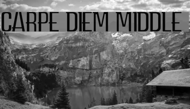
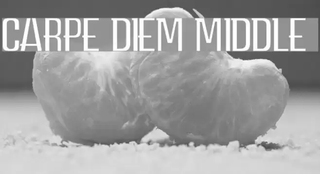
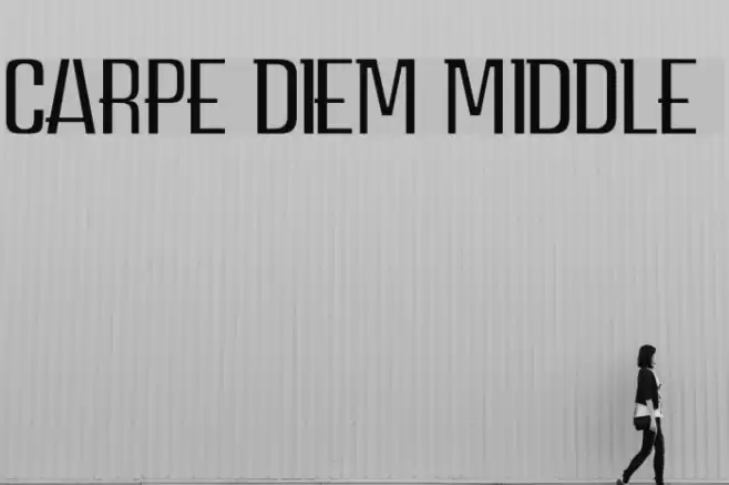
Gallery Examples
Download
623 Downloads
Download Free Fonts
Commercial Fonts Fonts
-
 Buy font Diem Gibling Regular Commercial Fonts
 -
 Buy font The Carpenter Commercial Fonts
 -
 Buy font The Carpenter Ornaments Commercial Fonts