CAUTION Font

CAUTION Description
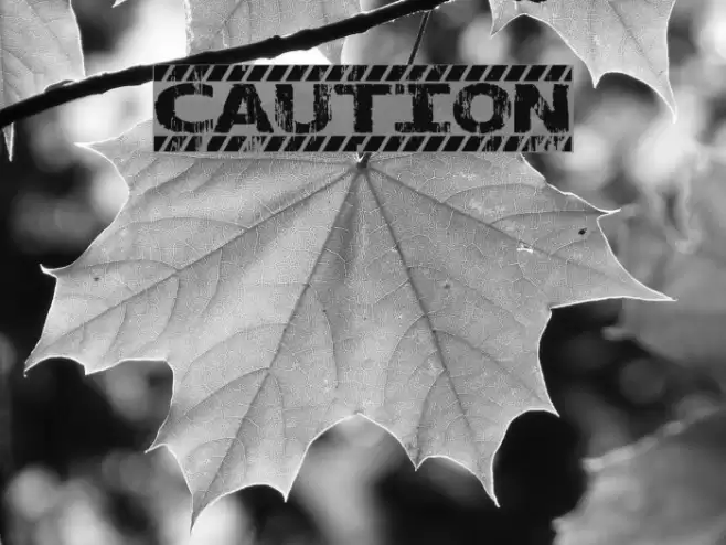
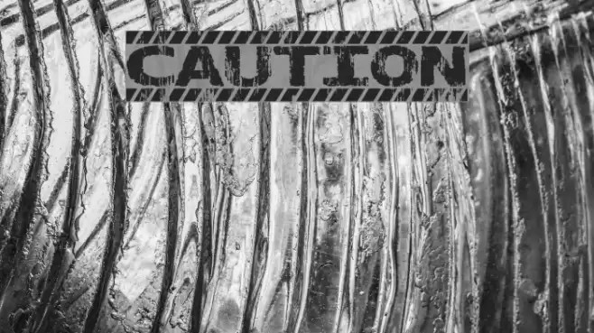
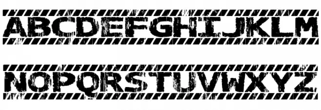
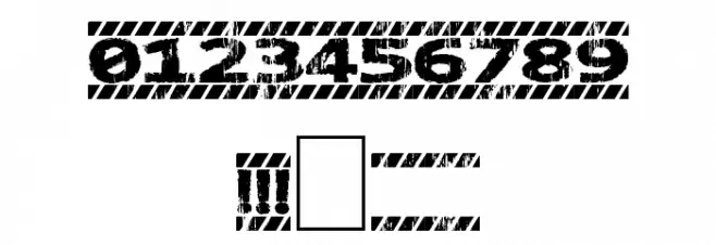
This font features a bold, distressed style with a stencil-like appearance, reminiscent of industrial warning signs. The characters are uppercase and have a rugged texture, giving them a worn, gritty look. The design includes diagonal stripes that add to the cautionary theme, making it ideal for attention-grabbing headlines or signage. The numbers and special characters maintain the same distressed aesthetic, ensuring consistency across all elements.
A bold, distressed stencil font with an industrial warning sign aesthetic from Distorted Eroded fonts.
- Downloads: 872
- ( jaydegarrow.wix.com/jaydefonts FREE )
- CAUTION.ttf
- Font: CAUTION
- Weight: Regular
- Version: Version Version 1.00 June 17, 2014, initial release
- No. of Characters:: 69
- Proposed Projects: Ideal for projects requiring an industrial or cautionary theme, such as warning signs, posters, or branding for construction-related businesses.
- Category:
- Bold: Yes
- Italic: No
- Weight: Bold
- Width: Normal
- Character Spacing: Normal
- Contrast: Low
- Overall Style: Industrial, Rugged
- Use Case: Headlines, Signage, Branding
- Encoding Scheme:
- Is Fixed Pitch: No
Glyphs ! . 0 1 2 3 4 5 6 7 8 9 ? A B C D E F G H I J K L M N O P Q R S T U V W X Y Z a b c d e f g h i j k l m n o p q r s t u v w x y z
CAUTION UPPERCASE

CAUTION LOWERCASE
CAUTION OTHER CHARS
Gallery Examples