Caperput Font

Caperput Description
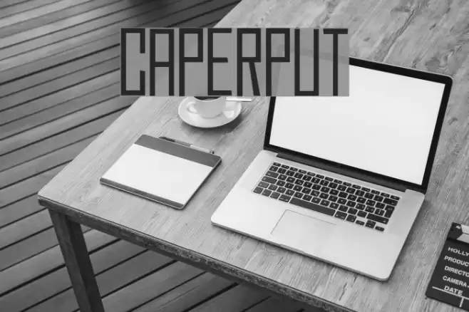
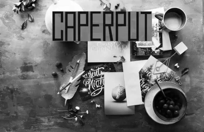
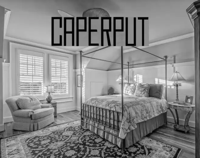
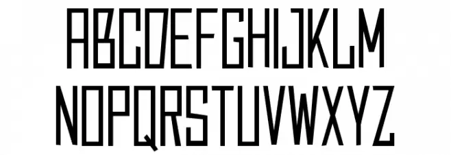
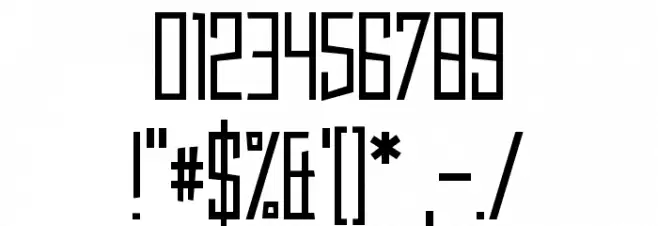
This font features a modern and geometric design with a strong emphasis on vertical lines and sharp angles. The characters are tall and narrow, giving a condensed appearance that is both sleek and stylish. The uppercase letters are particularly striking, with a uniform height and consistent stroke width that conveys a sense of precision and order. The numerals and special characters maintain this aesthetic, ensuring a cohesive look across all elements. The font's clean lines and minimalistic style make it highly legible, even at smaller sizes, while its distinctive form adds a touch of sophistication to any project.
A modern, geometric font with tall, narrow characters and sharp angles from Uncategorized fonts.
- Downloads: 189
- Caperput.otf
- Font: Caperput
- Weight: Regular
- Version: Version 1.00 July 19, 2016, initial release
- No. of Characters:: 98
- Proposed Projects: Ideal for branding, editorial design, posters, and digital interfaces where a modern and sleek appearance is desired.
- Category:
- Bold: No
- Italic: No
- Weight: Regular
- Width: Condensed
- Character Spacing: Normal
- Contrast: Low
- Overall Style: Modern
- Use Case: Headlines, Logos, Digital Interfaces
- Encoding Scheme:
- Is Fixed Pitch: No
Glyphs ! # $ % ( ) * + , - . / 0 1 2 3 4 5 6 7 8 9 : ; = ? @ A B C D E F G H I J K L M N O P Q R S T U V W X Y Z [ ] ^ _ ` a b c d e f g h i j k l m n o p q r s t u v w x y z { | } ~ ;
Caperput UPPERCASE

Caperput LOWERCASE
Caperput OTHER CHARS
Gallery Examples