Cempe west Font

Cempe west Description
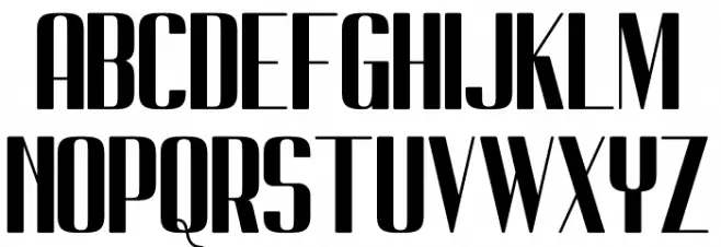
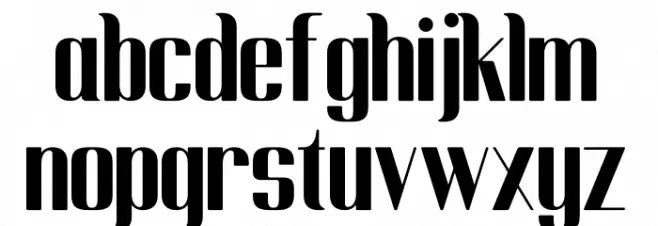
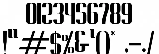
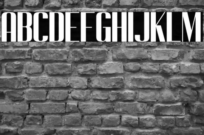
This font features a bold and striking design with high contrast between thick and thin strokes, giving it a dramatic and eye-catching appearance. The uppercase letters are tall and narrow, while the lowercase letters maintain a consistent style with slightly more rounded forms. The numerals are distinct and align well with the overall aesthetic, providing a cohesive look. Special characters are designed with the same boldness, ensuring they stand out. This font's unique style makes it suitable for impactful designs where attention is key.
A bold, high-contrast font with dramatic and eye-catching strokes from Uncategorized fonts.
- Downloads: 146
- ( Fonts by Kong Font - https://fontkong.com/ - Personal-use only. For commercial use please contact owner. FREE )
- Cempe west.otf
- Font: Cempe west
- Weight:
- Version:
- No. of Characters:: over 20
- Proposed Projects: Ideal for posters, headlines, branding, and any project requiring a strong visual impact.
- Category:
- Bold: Yes
- Italic: No
- Weight: Bold
- Width: Condensed
- Character Spacing: Normal
- Contrast: High
- Overall Style: Modern
- Use Case: Headlines, Logos
- Encoding Scheme:
- Is Fixed Pitch: No
Glyphs
Cempe west UPPERCASE
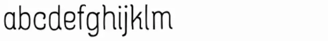
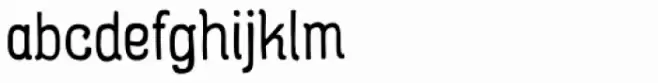
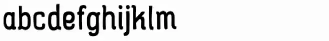
Cempe west LOWERCASE
Cempe west OTHER CHARS
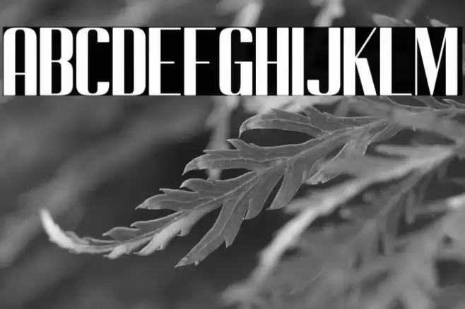
Gallery Examples

Download
146 Downloads
-
 Buy font Rainier West 100 Commercial Fonts
 -
 Buy font Rainier West 300 Commercial Fonts
 -
 Buy font Rainier West 500 Commercial Fonts