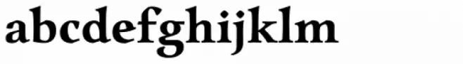
Charpentier Renaissance Reduced Demi Font

Charpentier Renaissance Reduced Demi Description
This font embodies a classic and elegant style, reminiscent of Renaissance typography. It features distinct serifs and a balanced proportion, giving it a timeless and sophisticated appearance. The uppercase letters are bold and commanding, while the lowercase letters maintain a graceful flow. The font's structure is well-defined, with moderate contrast between thick and thin strokes, enhancing readability. Its traditional aesthetic makes it suitable for formal and historical contexts, while its clarity ensures it remains legible in various sizes.
A classic serif font with elegant, Renaissance-inspired design and moderate contrast from Uncategorized fonts.
- Downloads: 71
- ( Fonts by ingoFonts - Ingo Zimmermann - Personal-use only. For commercial use please contact owner. FREE )
- Font: Charpentier Renaissance Reduced Demi
- Weight: Bold
- Version: Version Version 4.001
- No. of Characters:: 57
- Proposed Projects: Ideal for use in formal invitations, historical publications, book covers, and branding that requires a touch of sophistication.
- Category:
- Bold: Yes
- Italic: No
- Weight: Bold
- Width: Normal
- Character Spacing: Normal
- Contrast: Medium
- Overall Style: Classic
- Use Case: Headlines, Logos, Formal documents
- Encoding Scheme:
- Is Fixed Pitch: No
Glyphs . A B C D E F G H I J K L M N O P Q R S T U V W X Y Z a b c d e f g h i j k l m n o p q r s t u v w x y z
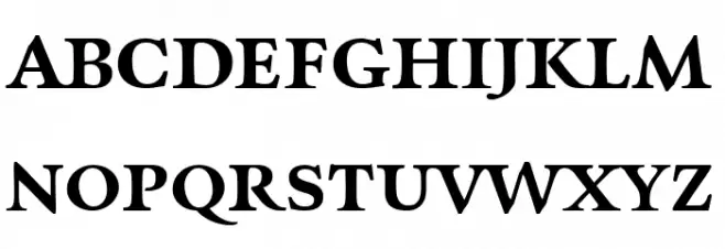
Charpentier Renaissance Reduced Demi UPPERCASE
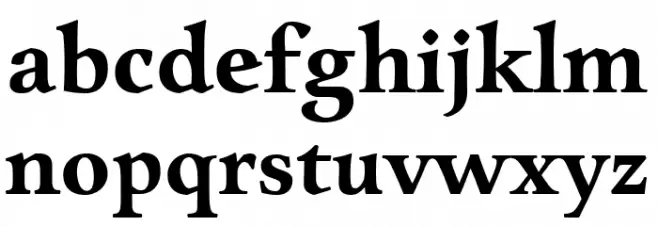
Charpentier Renaissance Reduced Demi LOWERCASE
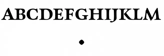
Charpentier Renaissance Reduced Demi OTHER CHARS
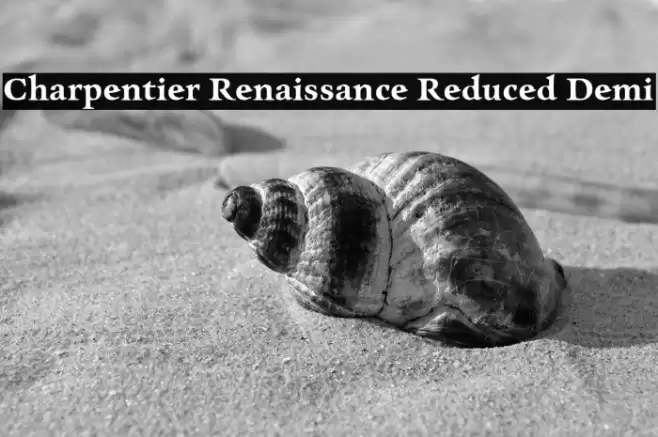
Gallery Examples


-
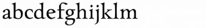 Buy font Charpentier Renaissance Pro Normal Commercial Fonts
 -
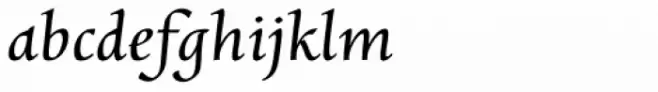 Buy font Charpentier Renaissance Pro Oblique Commercial Fonts
 -
 Buy font Charpentier Renaissance Pro Demi Commercial Fonts