Charpentier Renaissance Reduced Oblique Font

Charpentier Renaissance Reduced Oblique Description
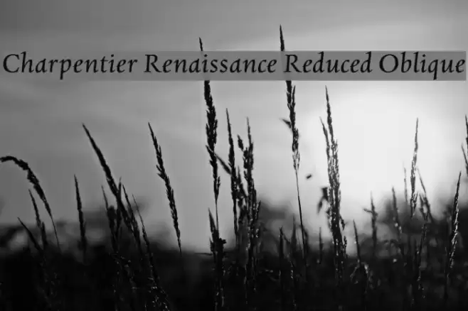
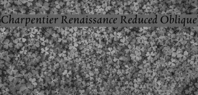
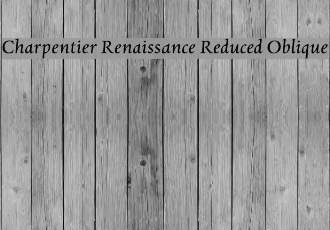
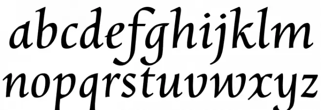
This font exudes a classic and elegant style, reminiscent of Renaissance calligraphy. The characters are slightly oblique, giving them a dynamic and sophisticated appearance. The serifs are pronounced yet refined, adding a touch of traditional charm. The uppercase letters are stately and well-proportioned, while the lowercase letters maintain a graceful flow. The overall design is balanced, with moderate contrast in stroke thickness, enhancing readability while preserving an artistic flair. This font is ideal for projects that require a historical or formal aesthetic.
A classic, elegant serif font with oblique characters and Renaissance charm from Uncategorized fonts.
- Downloads: 177
- ( ingoFonts - Ingo Zimmermann - www.ingofonts.com FREE )
- CharpentierRenRed-Oblique.ttf
- Font: Charpentier Renaissance Reduced Oblique
- Weight: Oblique
- Version: Version Version 3.019
- No. of Characters:: 56
- Proposed Projects: Perfect for wedding invitations, historical publications, formal branding, and elegant signage.
- Category:
- Bold: No
- Italic: Yes
- Weight: Regular
- Width: Normal
- Character Spacing: Normal
- Contrast: Medium
- Overall Style: Classic
- Use Case: Headlines, Body text, Logos
- Encoding Scheme:
- Is Fixed Pitch: No
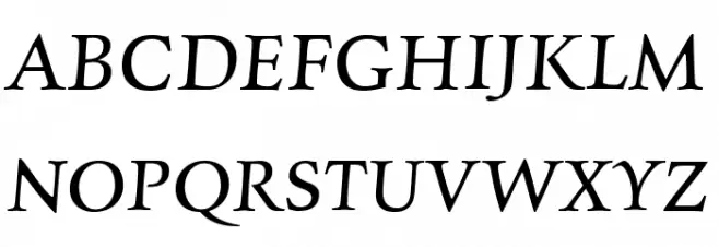
Glyphs A B C D E F G H I J K L M N O P Q R S T U V W X Y Z a b c d e f g h i j k l m n o p q r s t u v w x y z
Charpentier Renaissance Reduced Oblique UPPERCASE
Charpentier Renaissance Reduced Oblique LOWERCASE
Charpentier Renaissance Reduced Oblique OTHER CHARS

Gallery Examples