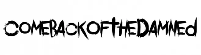
Comeback Of The Damned Font
Comeback Of The Damned Description
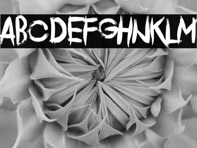
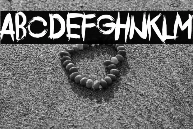
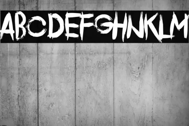
This font features a bold, distressed style with a hand-painted appearance. The characters are jagged and uneven, giving it a raw, edgy feel. The strokes are thick and vary in width, creating a dynamic and energetic look. The uppercase and lowercase letters maintain a consistent style, with sharp angles and rough edges. The numbers and special characters follow the same aesthetic, adding to the overall cohesive design. This font is ideal for projects that require a grunge or rebellious theme, as it captures attention with its bold and unconventional appearance.
A bold, distressed font with a hand-painted, edgy style from Uncategorized fonts.
- Downloads: 36
- ( Fonts by Chequered Ink - Personal-use only. For commercial use please contact owner. FREE )
- Font: Comeback Of The Damned
- Weight:
- Version:
- No. of Characters:: over 20
- Proposed Projects: Ideal for album covers, posters, streetwear branding, and edgy graphic designs.
- Category:
- Bold: Yes
- Italic: No
- Weight: Bold
- Width: Normal
- Character Spacing: Normal
- Contrast: High
- Overall Style: Decorative
- Use Case: Headlines, Logos
- Encoding Scheme:
- Is Fixed Pitch: No
Glyphs
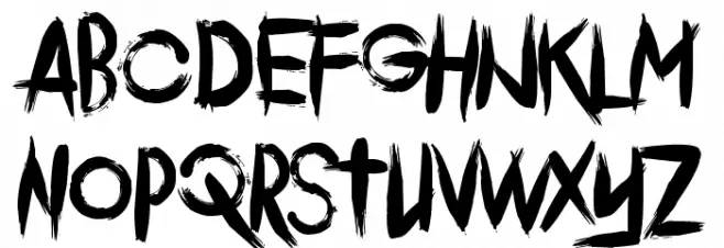
Comeback Of The Damned UPPERCASE
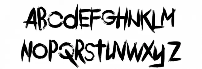
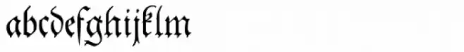
Comeback Of The Damned LOWERCASE
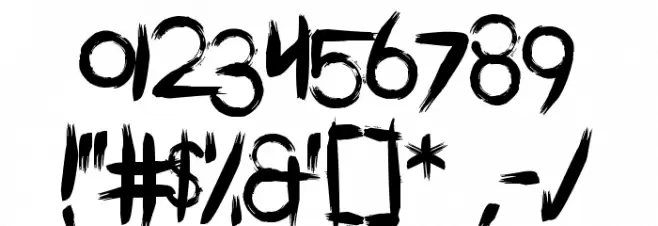
Comeback Of The Damned OTHER CHARS
Gallery Examples
Download
36 Downloads
-
 Buy font Christmas Comeback Regular Commercial Fonts
 -
 Buy font Theuerdank Fraktur Pro Commercial Fonts
 -
 Buy font Theater Lights JNL Commercial Fonts