Compare Light Regular Font
Compare Light Regular Description
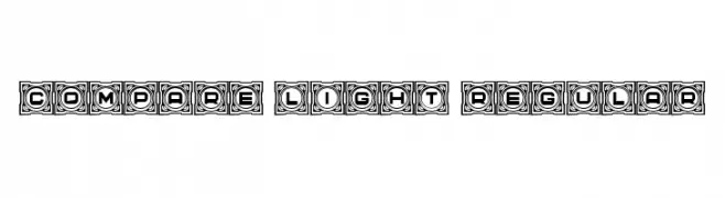
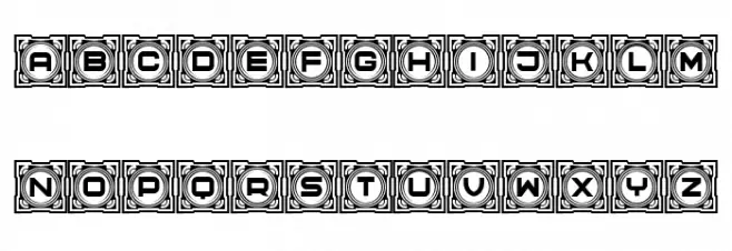
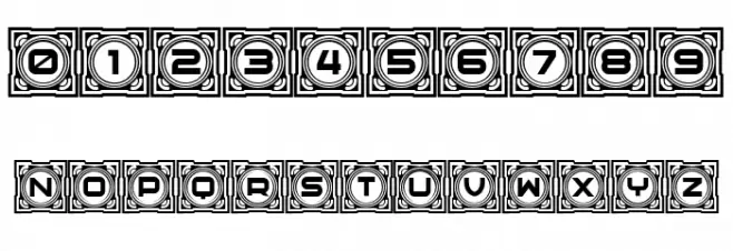
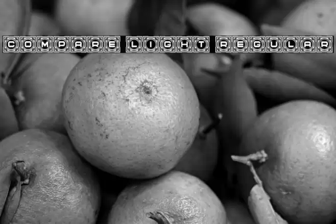
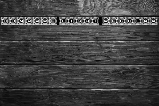
This font features a bold and decorative style, with each character encased in an ornate, square frame. The letters are uppercase and have a geometric, block-like appearance, which adds to the overall decorative feel. The numbers follow the same design, maintaining consistency across the character set. The intricate border around each character gives it a unique, eye-catching look, making it suitable for projects that require a strong visual impact. The font's design is reminiscent of vintage or retro styles, with a modern twist due to its geometric precision.
A bold, decorative font with ornate square frames around each character from Uncategorized fonts.
- Downloads: 49
- ( Fonts by Vladimir Nikolic - www.creativefabrica.com/designer/vladimirnikolic/ - Personal-use only. For commercial use please contact owner. FREE )
- Font: Compare Light Regular
- Weight: Regular
- Version: Version Version 1.000
- No. of Characters:: 66
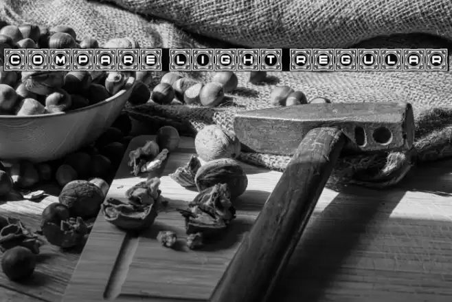
- Proposed Projects: Ideal for posters, album covers, branding, and any project that requires a striking and decorative typeface.
- Category:
- Bold: Yes
- Italic: No
- Weight: Bold
- Width: Normal
- Character Spacing: Normal
- Contrast: Medium
- Overall Style: Decorative
- Use Case: Headlines, Logos, Posters
- Encoding Scheme:
- Is Fixed Pitch: No
Glyphs 0 1 2 3 4 5 6 7 8 9 A B C D E F G H I J K L M N O P Q R S T U V W X Y Z a b c d e f g h i j k l m n o p q r s t u v w x y z
Compare Light Regular UPPERCASE
Compare Light Regular LOWERCASE

Compare Light Regular OTHER CHARS
Gallery Examples
-
 Buy font Gerlach Sans Light Italic Commercial Fonts
 -
 Buy font Gerlach Sans Light Commercial Fonts
 -
 Buy font Another Shabby Light Commercial Fonts