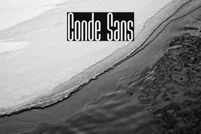
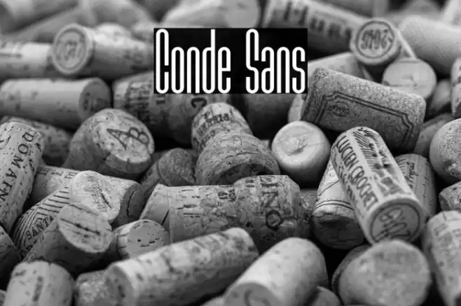
Conde Sans Font

Conde Sans Description
This font features a tall and narrow design, characterized by its condensed letterforms and clean lines. The uppercase and lowercase letters maintain a consistent height, creating a uniform appearance. The strokes are even and consistent, with minimal contrast, giving it a sleek and modern look. The numerals and special characters follow the same design principles, ensuring a cohesive appearance across all characters. The font's geometric structure and elongated forms make it stand out, while its simplicity ensures readability.
A tall, narrow, and modern sans-serif font with consistent stroke width from Uncategorized fonts.
- Downloads: 126
- ( Fonts by Tomás Castiglioni - Personal-use only. For commercial use please contact owner. FREE )
- Font: Conde Sans
- Weight: Bold
- Version: Version 1.002;Fontself Maker 3.4.0
- No. of Characters:: 113
- Proposed Projects: Ideal for modern branding, editorial headlines, posters, and minimalist design projects.
- Category:
- Bold: No
- Italic: No
- Weight: Regular
- Width: Condensed
- Character Spacing: Tight
- Contrast: Low
- Overall Style: Modern
- Use Case: Headlines, Logos
- Encoding Scheme:
- Is Fixed Pitch: No
Glyphs ! # $ % ( ) + , - . / 0 1 2 3 4 5 6 7 8 9 : ; = ? A B C D E F G H I J K L M N O P Q R S T U V W X Y Z [ ] _ a b c d e f g h i j k l m n o p q r s t u v w x y z | fi
Conde Sans UPPERCASE
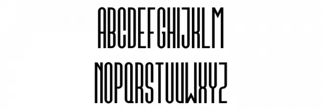
Conde Sans LOWERCASE

Conde Sans OTHER CHARS

Gallery Examples

-
 Buy font Hayne Sans Condensed Multiple Commercial Fonts
 -
 Buy font Hayne Sans Condensed Bold Multiple Commercial Fonts
 -
 Buy font Haboro Soft Condensed Bold Commercial Fonts