Conflict of interest Font

Conflict of interest Description
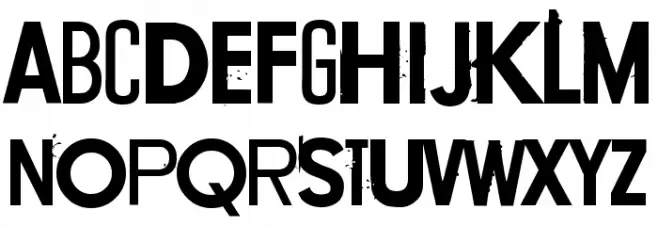
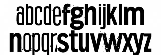
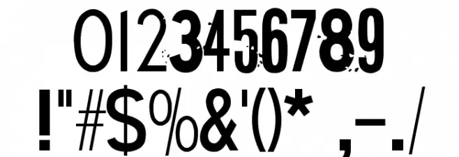
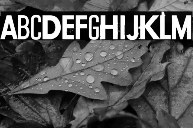
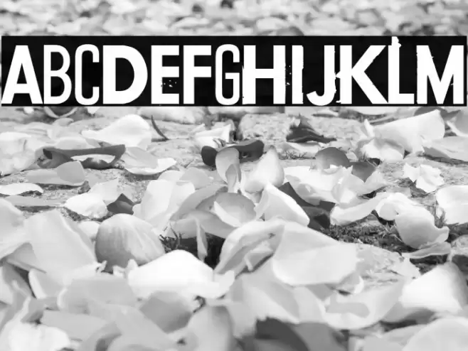
This font features a bold and impactful design with a distressed, grunge texture that gives it a rugged and edgy appearance. The uppercase letters are strong and commanding, while the lowercase letters maintain a consistent style, offering a cohesive look. The numerals and special characters are designed to match the boldness of the alphabet, ensuring uniformity across all characters. The font's unique texture adds character and depth, making it ideal for projects that require a bold statement or an urban, gritty feel. Its versatility allows it to be used in various creative contexts, from posters and album covers to branding and advertising materials.
A bold, distressed font with a grunge texture, perfect for impactful designs from Uncategorized fonts.
- Downloads: 55
- ( Fonts by junkohanhero - Personal-use only. For commercial use please contact owner. FREE )
- Font: Conflict of interest
- Weight:
- Version:
- No. of Characters:: over 20
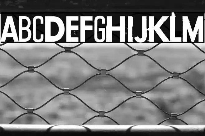
- Proposed Projects: Ideal for posters, album covers, branding, advertising, and any project needing a bold, edgy look.
- Category:
- Bold: Yes
- Italic: No
- Weight: Bold
- Width: Normal
- Character Spacing: Normal
- Contrast: Medium
- Overall Style: Decorative, Grunge
- Use Case: Headlines, Logos, Posters
- Encoding Scheme:
- Is Fixed Pitch: No
Glyphs
Conflict of interest UPPERCASE
Conflict of interest LOWERCASE
Conflict of interest OTHER CHARS
Gallery Examples
-
 Buy font Accrued Interest Inside Commercial Fonts
 -
 Buy font Public Interest Regular Commercial Fonts
 -
 Buy font Public Interest Italic Commercial Fonts