Fonts
Crayon Kids 2 Font
Description
- Crayon Kids 2.ttf
- Font: Crayon Kids 2
- Weight: Regular
- Version: 2.0 08.05.98
- No. of Characters:: 18
- Encoding Scheme:
- Is Fixed Pitch: 0
Welcome to the Font Trends page — your destination for discovering which fonts are shaping today’s design landscape. Whether you’re working on a brand refresh, social media visuals, or website UI, following current font trends helps your work feel fresh and relevant.
This collection features the most trending fonts of the season, chosen by designers and creators across the world. Expect to see elegant serifs, minimalist sans serifs, expressive display fonts, and handcrafted scripts that define modern aesthetics in 2025.
Combine your favorite trending typefaces with timeless categories like Modern, Serif, or Handwritten for a balanced and eye-catching design.
-
 Download 383 Downloads@WebFont
 -
![Clink Outlined Free Fonts Download]() Download 421 Downloads@WebFont
Download 421 Downloads@WebFont -
![Clink Free Fonts Download]() Download 562 Downloads@WebFont
Download 562 Downloads@WebFont -
( Fonts by Benoit Sjoholm - www.benoitsjoholm.com - All my fonts are for sale )
A bold, geometric font with a modern, tech-inspired aesthetic.
![Yatis black Free Fonts Download]() Download 189 Downloads@WebFont
Download 189 Downloads@WebFont -
![Winterland Free Fonts Download]() Download 375 Downloads@WebFont
Download 375 Downloads@WebFont -
![Smoke-Rasterized-Medium Free Fonts Download]() Download 212 Downloads@WebFont
Download 212 Downloads@WebFont -
( Fonts by Spork Thug Typography - Josh Wilhelm - www.lifewithouttaffy.com/taffy/blog )
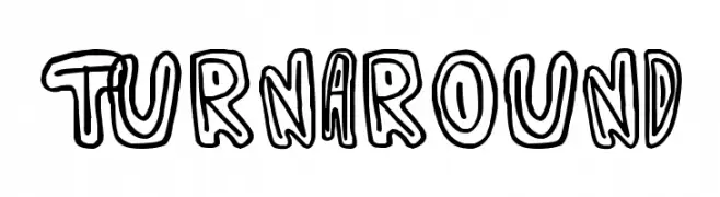
A playful, hand-drawn font with bold outlines and a cartoonish style.
![Turnaround Free Fonts Download]() Download 160 Downloads@WebFont
Download 160 Downloads@WebFont -
( Fonts by Harold Lohner - www.haroldsfonts.com )
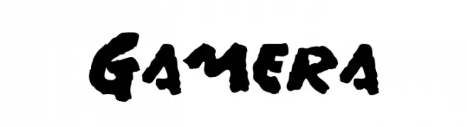
A bold, hand-painted style font with dynamic, expressive characters.
![Gamera Free Fonts Download]() Download 448 Downloads@WebFont
Download 448 Downloads@WebFont


FAQ — Font Trends
What are the current font trends?
Simplicity, legibility, and warmth dominate: rounded sans serifs, high-contrast serifs, and tasteful retro revivals are everywhere — clean but human.
Which fonts are trending in design right now?
Popular choices include Spellstone, Clink Outlined, Clink, Yatis black and Winterland — fonts known for their balance between modern and timeless. They look great on web pages, social content, and packaging, bringing a clean yet expressive feel.
How do I use trending fonts in my projects?
Use one standout display font for titles and pair it with a simple sans serif for body text. This creates contrast without losing readability. Always test how your chosen font trend performs across screen sizes and branding materials before finalizing.
💡 Tip: Refresh key assets every few months with a new trending font to keep visuals sharp and discoverable.