CutMeOut2 Font

CutMeOut2 Description
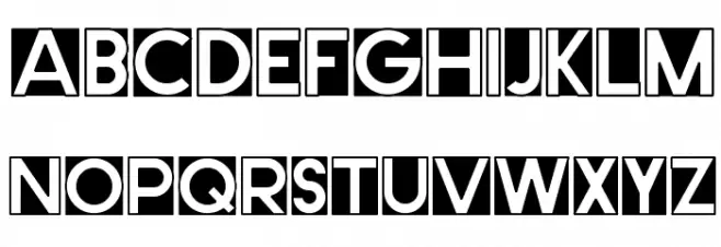
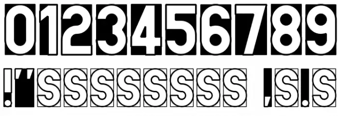
This font features a bold, geometric design with a strong emphasis on negative space. Each character is enclosed within a square, creating a striking visual effect that is both modern and eye-catching. The uppercase letters are uniform in height and width, contributing to a cohesive and structured appearance. The numbers follow the same design principles, maintaining consistency across the character set. The special characters are integrated seamlessly, enhancing the font's versatility. This font's unique style makes it ideal for creative projects that require a bold statement.
A bold, geometric font with strong negative space and uniform character design from Uncategorized fonts.
- Downloads: 255
- ( Fonts by www.peter-wiegel.de. Personal-use only. For commercial use please contact owner. FREE )
- CutMeOut2.ttf
- Font: CutMeOut2
- Weight: Regular
- Version: Version
- No. of Characters:: 87
- Proposed Projects: Ideal for posters, logos, branding, and any design that requires a bold, modern aesthetic.
- Category:
- Bold: Yes
- Italic: No
- Weight: Bold
- Width: Normal
- Character Spacing: Normal
- Contrast: High
- Overall Style: Modern
- Use Case: Headlines, Logos
- Encoding Scheme:
- Is Fixed Pitch: No
Glyphs ! , . 0 1 2 3 4 5 6 7 8 9 : ; ? A B C D E F G H I J K L M N O P Q R S T U V W X Y Z a b c d e f g h i j k l m n o p q r s t u v w x y z
CutMeOut2 UPPERCASE
CutMeOut2 LOWERCASE

CutMeOut2 OTHER CHARS
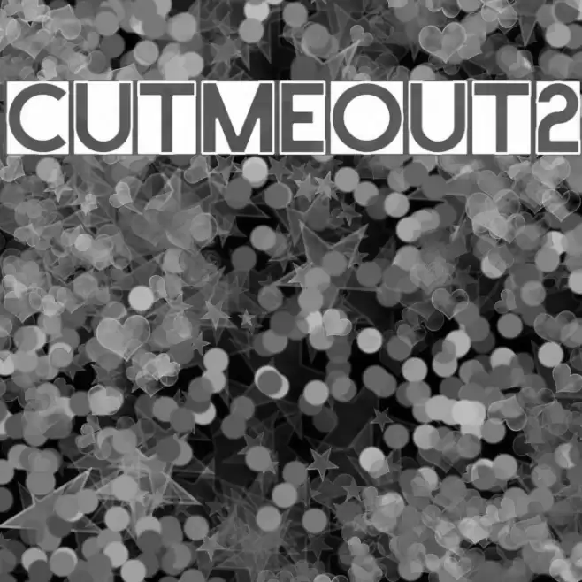
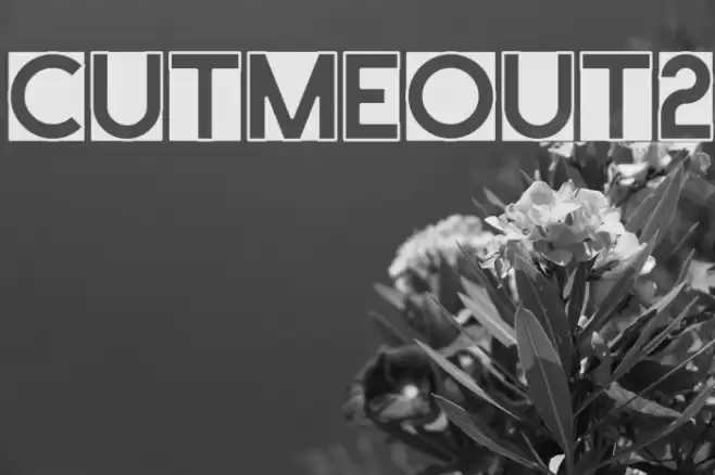
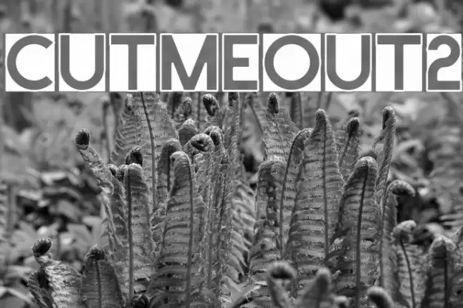
Gallery Examples