Fonts
Cyberfall Italic Font
Description
- Cyberfall Italic.otf
- Font: Cyberfall Italic
- Weight: Italic
- Version: Version 1.60 January 22, 2015
- No. of Characters:: 236
- Encoding Scheme:
- Is Fixed Pitch: 0
Welcome to the Font Trends page — your destination for discovering which fonts are shaping today’s design landscape. Whether you’re working on a brand refresh, social media visuals, or website UI, following current font trends helps your work feel fresh and relevant.
This collection features the most trending fonts of the season, chosen by designers and creators across the world. Expect to see elegant serifs, minimalist sans serifs, expressive display fonts, and handcrafted scripts that define modern aesthetics in 2025.
Combine your favorite trending typefaces with timeless categories like Modern, Serif, or Handwritten for a balanced and eye-catching design.
-
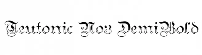
( Fonts by Paul Lloyd )
A Gothic-inspired font with ornate, medieval-style characters.
 Download 734 Downloads@WebFont
 -
( Fonts by Jacob Fisher - www.pizzadude.dk )
A bold, playful font with characters in rounded square borders, resembling game tiles.
![JoyCards Free Fonts Download]() Download 2017 Downloads@WebFont
Download 2017 Downloads@WebFont -
![Y2Kill Free Fonts Download]() Download 374 Downloads@WebFont
Download 374 Downloads@WebFont -
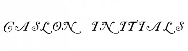
( Fonts by Paul Lloyd )
An elegant and ornate font with flowing, decorative characters.
![Caslon Initials Free Fonts Download]() Download 2047 Downloads@WebFont
Download 2047 Downloads@WebFont -
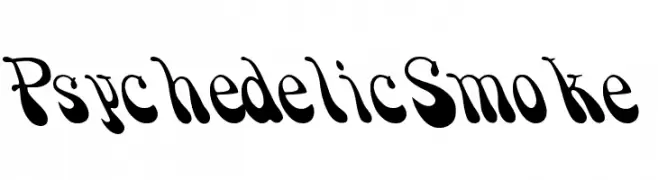
![PsychedelicSmoke Free Fonts Download]() Download 865 Downloads
Download 865 Downloads -
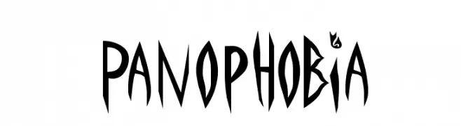
![Panophobia Free Fonts Download]() Download 1101 Downloads
Download 1101 Downloads -
( Fonts by Utopiafonts )
A futuristic, geometric font with sharp angles and clean lines.
![The Monkies Ate My Soul Free Fonts Download]() Download 359 Downloads@WebFont
Download 359 Downloads@WebFont -
![Campfire Free Fonts Download]() Download 2746 Downloads
Download 2746 Downloads


FAQ — Font Trends
What are the current font trends?
Simplicity, legibility, and warmth dominate: rounded sans serifs, high-contrast serifs, and tasteful retro revivals are everywhere — clean but human.
Which fonts are trending in design right now?
Popular choices include Teutonic No3 DemiBold, JoyCards, Y2Kill, Caslon Initials and PsychedelicSmoke — fonts known for their balance between modern and timeless. They look great on web pages, social content, and packaging, bringing a clean yet expressive feel.
How do I use trending fonts in my projects?
Use one standout display font for titles and pair it with a simple sans serif for body text. This creates contrast without losing readability. Always test how your chosen font trend performs across screen sizes and branding materials before finalizing.
💡 Tip: Refresh key assets every few months with a new trending font to keep visuals sharp and discoverable.