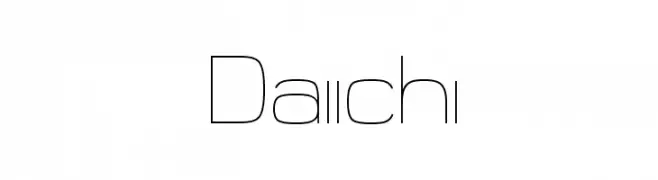
Daiichi Font
Daiichi Description
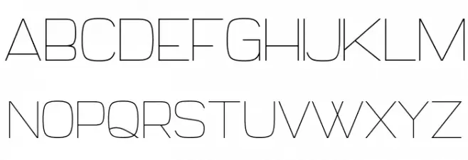
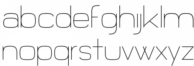
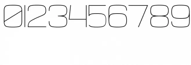
This font features a sleek, modern design with a geometric structure. The characters are composed of thin, uniform lines that give it a minimalist and clean appearance. The uppercase letters are tall and narrow, while the lowercase letters maintain a consistent height, providing a balanced look. The numerals are distinct and align well with the overall style, making them easily readable. The special characters are designed to match the font's aesthetic, ensuring a cohesive appearance across all text elements.
A sleek, modern font with a geometric and minimalist design from Uncategorized fonts.
- Downloads: 107
- ( Fonts by Michael Muranaka - muraknockout.com - Personal-use only. For commercial use please contact owner. FREE )
- Daiichi.ttf
- Font: Daiichi
- Weight: Regular
- Version: Version Version 1.00 October 2, 2012, initial release
- No. of Characters:: 236
- Proposed Projects: Ideal for modern branding, tech-related projects, minimalist designs, and contemporary advertising.
- Category:
- Bold: No
- Italic: No
- Weight: Light
- Width: Condensed
- Character Spacing: Normal
- Contrast: Low
- Overall Style: Modern
- Use Case: Headlines, Logos
- Encoding Scheme:
- Is Fixed Pitch: No
Glyphs ! # $ % ( ) * + , - . / 0 1 2 3 4 5 6 7 8 9 : ; = ? @ A B C D E F G H I J K L M N O P Q R S T U V W X Y Z [ ] ^ _ ` a b c d e f g h i j k l m n o p q r s t u v w x y z { | } ~
Daiichi UPPERCASE
Daiichi LOWERCASE
Daiichi OTHER CHARS
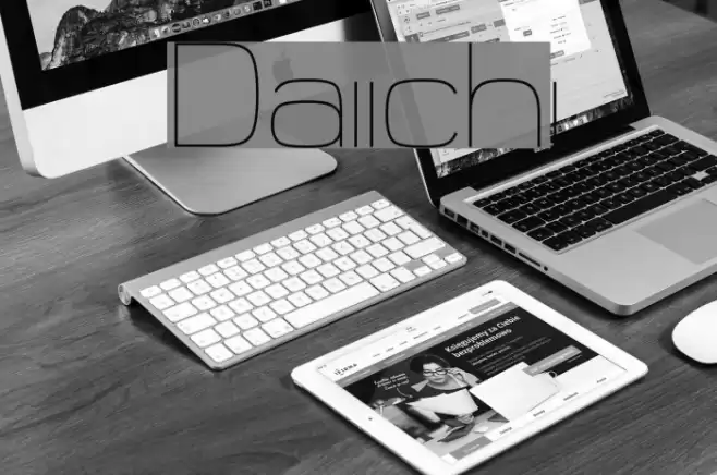
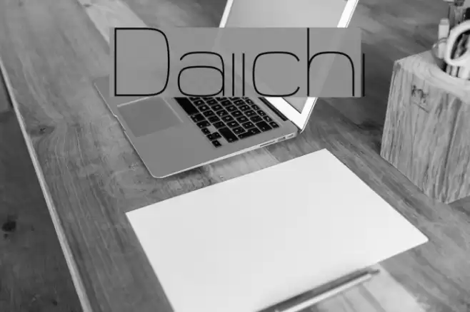
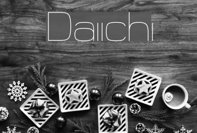
Gallery Examples
-
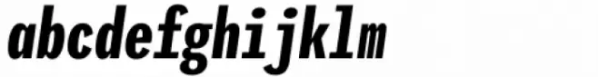
 Buy font Iki Mono Compressed Bold Commercial Fonts
 -
 Buy font Iki Mono Compressed Bold Slanted Commercial Fonts
 -
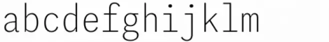 Buy font Iki Mono Condensed Thin Commercial Fonts