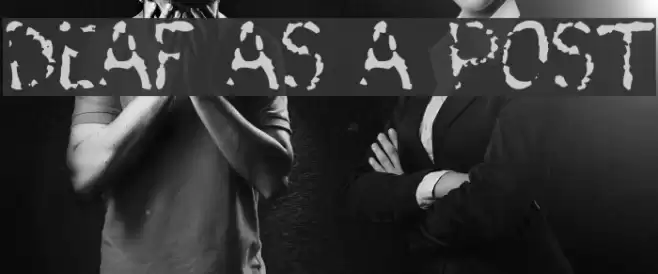
Deaf As A Post Font

Deaf As A Post Description
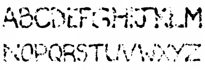
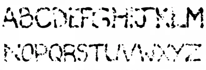
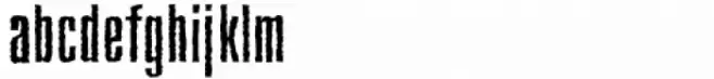
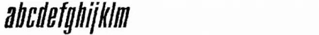
This font features a highly distressed and eroded style, giving it a rugged and weathered appearance. The characters appear as if they have been worn away over time, with irregular edges and gaps that create a unique, textured look. Despite its roughness, the font maintains legibility, making it suitable for designs that require a gritty or industrial feel. The uppercase and lowercase letters, along with numbers and special characters, all share this distinctive, broken aesthetic, making it ideal for projects that aim to convey a sense of age, decay, or urban grit.
A distressed, eroded font with a rugged, weathered appearance from Broken fonts.
- Downloads: 451
- deafas.ttf
- Font: Deaf As A Post
- Weight: Regular
- Version: Version sept2001
- No. of Characters:: 138
- Proposed Projects: Ideal for album covers, movie posters, urban-themed designs, or any project requiring a gritty, industrial look.
- Category:
- Bold: Yes
- Italic: No
- Weight: Bold
- Width: Normal
- Character Spacing: Normal
- Contrast: Low
- Overall Style: Decorative
- Use Case: Headlines, Posters, Logos
- Encoding Scheme:
- Is Fixed Pitch: No
Glyphs ! # $ % ( ) * + , - . / 0 1 2 3 4 5 6 7 8 9 : ; = ? @ A B C D E F G H I J K L M N O P Q R S T U V W X Y Z [ ] ^ _
Deaf As A Post UPPERCASE
Deaf As A Post LOWERCASE
Deaf As A Post OTHER CHARS

Gallery Examples


Download Free Fonts
Commercial Fonts Fonts
-
 Buy font Deaffont Regular Commercial Fonts
 -
 Buy font Deaffont Italic Commercial Fonts
 -
 Buy font Astage Astage Commercial Fonts