Fonts
Delta Ray Gradient Font
Description
- DeltaRayGradient-xaKr.otf
- Font: Delta Ray Gradient
- Weight: Expanded Italic
- Version: Version 3.0; 2019
- No. of Characters:: 221
- Encoding Scheme:
- Is Fixed Pitch: 0
Welcome to the Font Trends page — your destination for discovering which fonts are shaping today’s design landscape. Whether you’re working on a brand refresh, social media visuals, or website UI, following current font trends helps your work feel fresh and relevant.
This collection features the most trending fonts of the season, chosen by designers and creators across the world. Expect to see elegant serifs, minimalist sans serifs, expressive display fonts, and handcrafted scripts that define modern aesthetics in 2025.
Combine your favorite trending typefaces with timeless categories like Modern, Serif, or Handwritten for a balanced and eye-catching design.
-
 Download 403 Downloads@WebFont
 -
![BowlORama Free Fonts Download]() Download 316 Downloads@WebFont
Download 316 Downloads@WebFont -
( Fonts by Michael Tension - www.TensionType.com )
A bold, distressed font with a rugged, textured appearance.
![Impact Label Reversed Free Fonts Download]() Download 3616 Downloads@WebFont
Download 3616 Downloads@WebFont -
( Fonts by Harold Lohner - www.haroldsfonts.com )
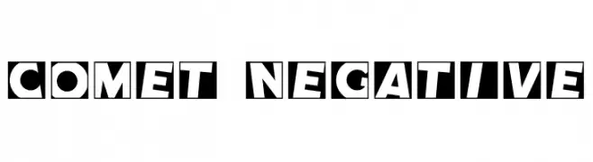
A bold, playful font with high contrast and unique negative space design.
![Comet Negative Free Fonts Download]() Download 1978 Downloads@WebFont
Download 1978 Downloads@WebFont -
( Fonts by Harold Lohner - www.haroldsfonts.com )
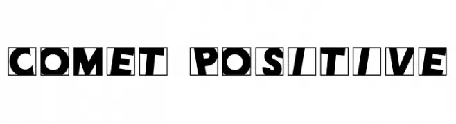
A bold, playful font with high contrast and dynamic, tilted characters enclosed in squares.
![Comet Positive Free Fonts Download]() Download 344 Downloads@WebFont
Download 344 Downloads@WebFont -
![101! StaR StuDDeD Free Fonts Download]() Download 3212 Downloads@WebFont
Download 3212 Downloads@WebFont -
![Scratchy Free Fonts Download]() Download 556 Downloads@WebFont
Download 556 Downloads@WebFont -
( Fonts by ARRF Designs )
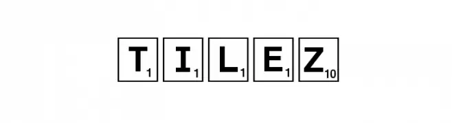
A bold, uppercase font styled like board game tiles with numbers.
![Tilez Free Fonts Download]() Download 428 Downloads@WebFont
Download 428 Downloads@WebFont


FAQ — Font Trends
What are the current font trends?
Simplicity, legibility, and warmth dominate: rounded sans serifs, high-contrast serifs, and tasteful retro revivals are everywhere — clean but human.
Which fonts are trending in design right now?
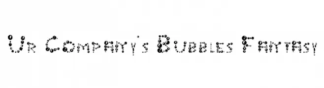
Popular choices include Ur Company's Bubbles Fantasy, BowlORama, Impact Label Reversed, Comet Negative and Comet Positive — fonts known for their balance between modern and timeless. They look great on web pages, social content, and packaging, bringing a clean yet expressive feel.
How do I use trending fonts in my projects?
Use one standout display font for titles and pair it with a simple sans serif for body text. This creates contrast without losing readability. Always test how your chosen font trend performs across screen sizes and branding materials before finalizing.
💡 Tip: Refresh key assets every few months with a new trending font to keep visuals sharp and discoverable.