Department K Font

Department K Description
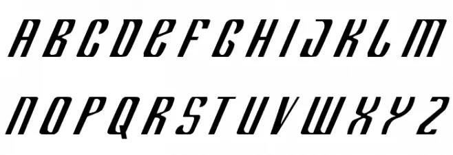
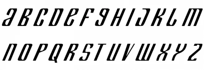
This font features a bold, italicized style with a modern and dynamic appearance. The characters are slightly condensed, giving a sleek and streamlined look. The strokes are consistent in width, providing a uniform and cohesive feel across all characters. The angular design of the letters adds a sense of movement and energy, making it suitable for projects that require a contemporary and edgy aesthetic. The font's high contrast between the thick and thin strokes enhances its readability and visual impact, making it ideal for attention-grabbing headlines and titles.
A bold, italicized font with a modern, dynamic style and high contrast from Uncategorized fonts.
- Downloads: 245
- ( Fonts by Daniel Zadorozny - www.iconian.com - Free for personal use FREE )
- deptk.ttf
- Font: Department K
- Weight: Regular
- Version: Version 1
- No. of Characters:: 91
- Proposed Projects: Ideal for branding, advertising, sports team logos, and dynamic headlines.
- Category:
- Bold: Yes
- Italic: Yes
- Weight: Bold
- Width: Condensed
- Character Spacing: Normal
- Contrast: High
- Overall Style: Modern
- Use Case: Headlines, Logos
- Encoding Scheme:
- Is Fixed Pitch: No
Glyphs ! ( ) + , - . / 0 1 2 3 4 5 6 7 8 9 : ; = ? A B C D E F G H I J K L M N O P Q R S T U V W X Y Z [ ] _ ` a b c d e f g h i j k l m n o p q r s t u v w x y z { | }
Department K UPPERCASE
Department K LOWERCASE
Department K OTHER CHARS

Gallery Examples


Download Free Fonts
Commercial Fonts Fonts
-
 Buy font Parks Department JNL Commercial Fonts
 -
 Buy font Stationery Department JNL Commercial Fonts
 -
 Buy font Zoning Department JNL Commercial Fonts