Fonts
Digit Tech 16 Italic Font
Description
- Font: Digit Tech 16 Italic
- Weight: Italic
- Version: Version 1.00
- No. of Characters:: 390
- Encoding Scheme:
- Is Fixed Pitch: 1
Welcome to the Font Trends page — your destination for discovering which fonts are shaping today’s design landscape. Whether you’re working on a brand refresh, social media visuals, or website UI, following current font trends helps your work feel fresh and relevant.
This collection features the most trending fonts of the season, chosen by designers and creators across the world. Expect to see elegant serifs, minimalist sans serifs, expressive display fonts, and handcrafted scripts that define modern aesthetics in 2025.
Combine your favorite trending typefaces with timeless categories like Modern, Serif, or Handwritten for a balanced and eye-catching design.
-
( Fonts by Blue Vinyl - Jess Latham - www.bvfonts.com )
A bold, geometric font with a modern and technical design.
 Download 344 Downloads@WebFont
 -
![Electric Hermes Free Fonts Download]() Download 886 Downloads@WebFont
Download 886 Downloads@WebFont -
( Fonts by Spork Thug Typography - Josh Wilhelm - www.lifewithouttaffy.com/taffy/blog )
A bold, playful font with chunky, irregular shapes and a vintage poster feel.
![Bogusflow Free Fonts Download]() Download 789 Downloads@WebFont
Download 789 Downloads@WebFont -
![Salmiak Gradient Free Fonts Download]() Download 224 Downloads@WebFont
Download 224 Downloads@WebFont -
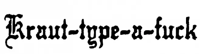
( Fonts by Mr Fisk - Mike Larsson - fontorama.net )
A bold, ornate Blackletter font with intricate details and a historic gothic style.
![Kraut-type-a-fuck Free Fonts Download]() Download 641 Downloads@WebFont
Download 641 Downloads@WebFont -
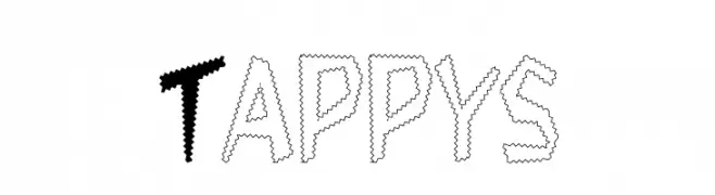
![Tappys Free Fonts Download]() Download 302 Downloads
Download 302 Downloads -
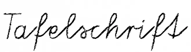
( Fonts by Anke Arnold - www.anke-art.de )
A cursive, handwritten font with a chalk-like texture.
![Tafelschrift Free Fonts Download]() Download 2045 Downloads@WebFont
Download 2045 Downloads@WebFont -
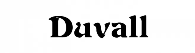
( Fonts by Paul Lloyd )
A bold, medieval-inspired font with sharp serifs and high contrast.
![Duvall Free Fonts Download]() Download 2174 Downloads@WebFont
Download 2174 Downloads@WebFont
FAQ — Font Trends
What are the current font trends?
Simplicity, legibility, and warmth dominate: rounded sans serifs, high-contrast serifs, and tasteful retro revivals are everywhere — clean but human.
Which fonts are trending in design right now?
Popular choices include NuWave BV 2.0, Electric Hermes, Bogusflow, Salmiak Gradient and Kraut-type-a-fuck — fonts known for their balance between modern and timeless. They look great on web pages, social content, and packaging, bringing a clean yet expressive feel.
How do I use trending fonts in my projects?
Use one standout display font for titles and pair it with a simple sans serif for body text. This creates contrast without losing readability. Always test how your chosen font trend performs across screen sizes and branding materials before finalizing.
💡 Tip: Refresh key assets every few months with a new trending font to keep visuals sharp and discoverable.