Do not eat this Font

Do not eat this Description
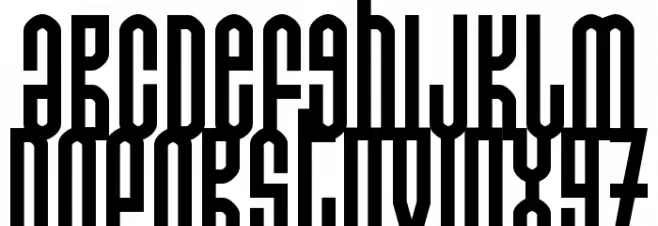
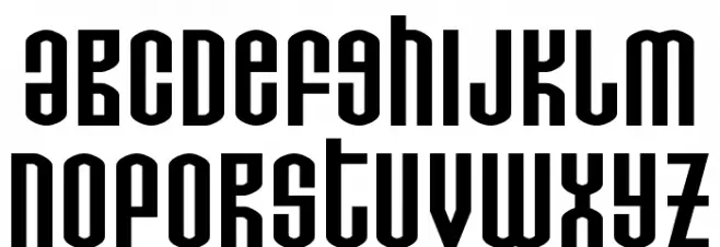
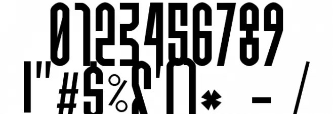
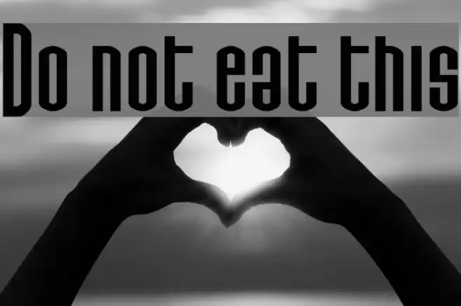
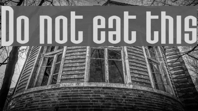
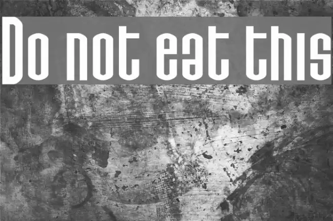
This font features a bold and condensed style with a strong vertical emphasis, creating a striking and impactful appearance. The characters are tall and narrow, with minimal spacing between them, which enhances the compact and dense look. The uppercase letters are particularly elongated, giving the font a unique and modern aesthetic. The lowercase letters maintain the same condensed structure, ensuring consistency throughout the typeface. The numerals and special characters follow the same design principles, contributing to the overall cohesive appearance. This font's boldness and distinctiveness make it suitable for attention-grabbing designs.
A bold, condensed font with a strong vertical emphasis and modern aesthetic from Sans Serif fonts.
- Downloads: 387
- ( Fonts by Jacob Fisher - www.pizzadude.dk FREE )
- Donoteatthis.ttf
- Font: Do not eat this
- Weight: Regular
- Version: Version www.pizzadude.dk - 310701
- No. of Characters:: 402
- Proposed Projects: Ideal for posters, headlines, branding, and any design requiring a bold statement.
- Category:
- Bold: Yes
- Italic: No
- Weight: Bold
- Width: Condensed
- Character Spacing: Tight
- Contrast: Low
- Overall Style: Modern
- Use Case: Headlines, Logos, Posters
- Encoding Scheme:
- Is Fixed Pitch: No
Glyphs ! # $ % ( ) * + , - . / 0 1 2 3 4 5 6 7 8 9 : ; = ? @ A B C D E F G H I J K L M N O P Q R S T U V W X Y Z [ ] ^ _ ` a b c d e f g h i j k l m n o p q r s t u v w x y z { | } ~
Do not eat this UPPERCASE
Do not eat this LOWERCASE
Do not eat this OTHER CHARS
Gallery Examples
Download Free Fonts
Commercial Fonts Fonts
-
 Buy font Thistle Borders Commercial Fonts
 -
 Buy font Thistails Font Duo Sricpt Regular Commercial Fonts
 -
 Buy font Thistails Font Duo Script Rough Commercial Fonts