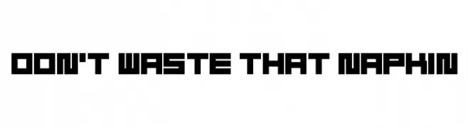
Don't Waste That Napkin Font
Don't Waste That Napkin Description
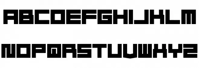
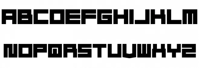
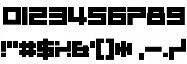
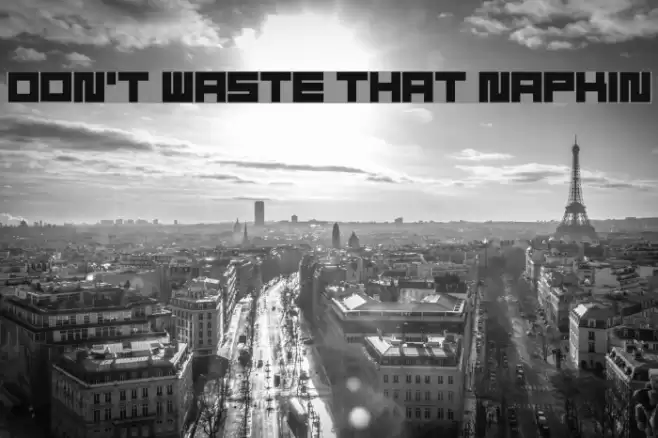
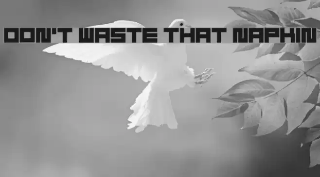
This font features a bold, geometric style with a strong emphasis on straight lines and right angles. The characters are uniformly thick, creating a sense of solidity and strength. Each letter and number is constructed with a blocky, almost pixelated appearance, reminiscent of early digital or arcade game aesthetics. The uppercase and lowercase letters maintain a consistent height, contributing to a monospaced feel, although the font itself is not strictly monospaced. The special characters are designed to match the overall blocky style, ensuring visual consistency across all elements.
A bold, geometric font with a blocky, digital aesthetic from Uncategorized fonts.
- Downloads: 283
- ( Fonts by Andrew McCluskey - nalgames.com. Personal-use only. For commercial use please contact owner. FREE )
- Don't Waste That Napkin.otf
- Font: Don't Waste That Napkin
- Weight: Regular
- Version: Version 1.00 July 22, 2014, initial release
- No. of Characters:: 98
- Proposed Projects: Ideal for retro-themed designs, video game graphics, posters, and branding that requires a strong, digital look.
- Category:
- Bold: Yes
- Italic: No
- Weight: Bold
- Width: Normal
- Character Spacing: Normal
- Contrast: Low
- Overall Style: Modern
- Use Case: Headlines, Logos
- Encoding Scheme:
- Is Fixed Pitch: No
Glyphs ! # $ % ( ) * + , - . / 0 1 2 3 4 5 6 7 8 9 : ; = ? @ A B C D E F G H I J K L M N O P Q R S T U V W X Y Z [ ] _ a b c d e f g h i j k l m n o p q r s t u v w x y z { | } ; fi fl
Don't Waste That Napkin UPPERCASE
Don't Waste That Napkin LOWERCASE
Don't Waste That Napkin OTHER CHARS
Gallery Examples

Download Free Fonts
Commercial Fonts Fonts
-
 Buy font Thats Amore Commercial Fonts
 -
 Buy font Thataway JNL Regular Commercial Fonts
 -
 Buy font Waste Of Time 7 Commercial Fonts