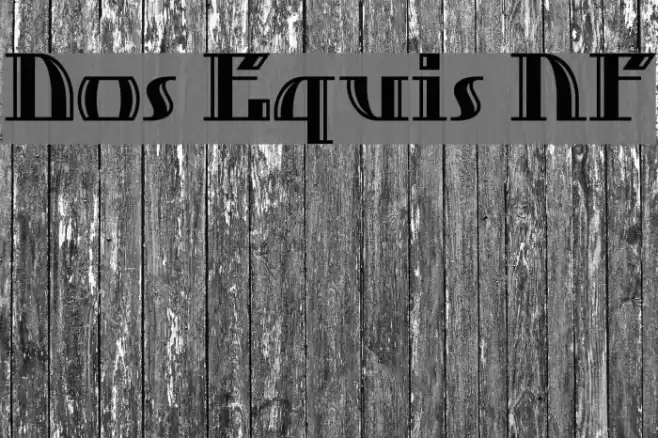
Dos Equis NF Font

Dos Equis NF Description
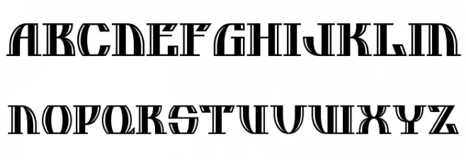
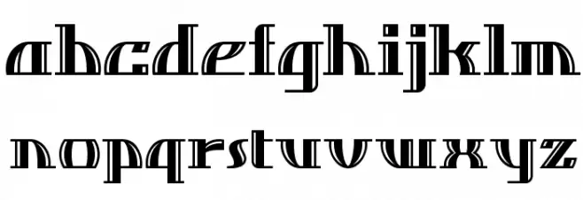
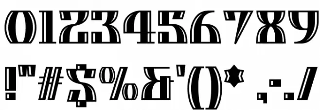
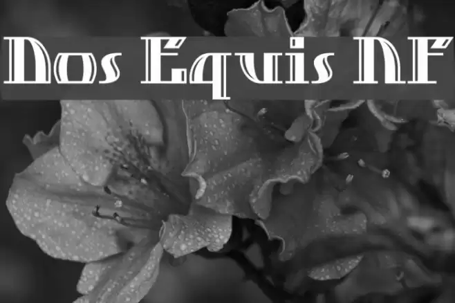
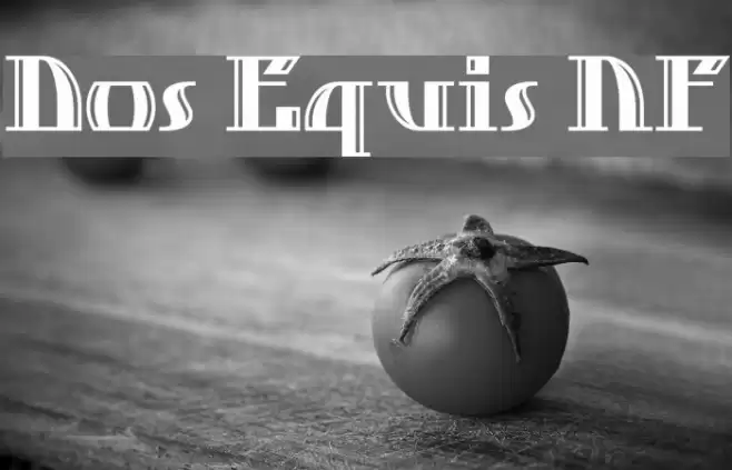
This font features a bold, geometric design with a distinct Art Deco influence. The characters are constructed with strong vertical and horizontal lines, creating a sense of structure and balance. The uppercase letters exhibit a unique blend of sharp angles and curves, while the lowercase letters maintain a consistent style with slightly more fluidity. Numbers and special characters follow the same aesthetic, ensuring a cohesive look across all glyphs. The font's high contrast between thick and thin strokes adds to its striking appearance, making it ideal for attention-grabbing designs.
A bold, geometric font with Art Deco influences and high contrast strokes from Retro fonts.
- Downloads: 339
- ( Fonts by Nick Curtis - www.nicksfonts.com FREE )
- DosEquisNF.ttf
- Font: Dos Equis NF
- Weight: Regular
- Version: Version Version 1.002
- No. of Characters:: 217
- Proposed Projects: Ideal for branding, posters, and editorial design where a bold statement is needed.
- Category:
- Bold: Yes
- Italic: No
- Weight: Bold
- Width: Normal
- Character Spacing: Normal
- Contrast: High
- Overall Style: Art Deco, Modern
- Use Case: Headlines, Logos, Posters
- Encoding Scheme:
- Is Fixed Pitch: No
Glyphs ! # $ % ( ) * + , - . / 0 1 2 3 4 5 6 7 8 9 : ; = ? @ A B C D E F G H I J K L M N O P Q R S T U V W X Y Z [ ] _ ` a b c d e f g h i j k l m n o p q r s t u v w x y z { }
Dos Equis NF UPPERCASE
Dos Equis NF LOWERCASE
Dos Equis NF OTHER CHARS
Gallery Examples
Download Free Fonts
Commercial Fonts Fonts
-
 Buy font Hamburger Heaven NFPro Commercial Fonts
 -
 Buy font Occulista Dos Commercial Fonts
 -
 Buy font Cazon Dos Commercial Fonts