Downcome Font
Downcome Description
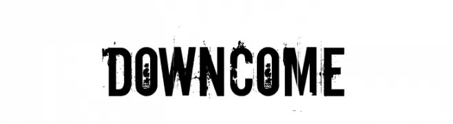
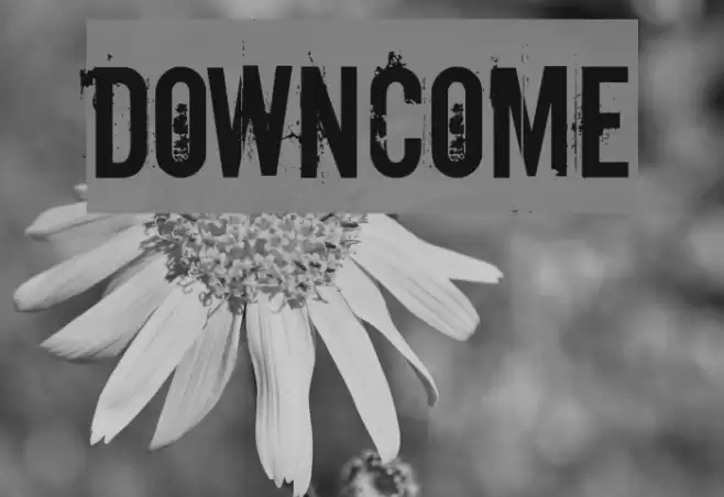
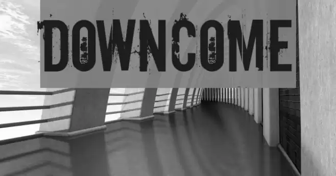
This font features a bold, distressed style with a grunge texture that gives it a rugged and worn appearance. The characters are uppercase and numerals, with a consistent height and width, creating a uniform look despite the distressed effect. The texture appears as if the letters have been eroded or weathered, adding a sense of age and character. This style is reminiscent of vintage or industrial design, making it suitable for projects that require a bold, impactful statement. The font's distressed nature adds a layer of complexity and visual interest, making it stand out in any design.
A bold, distressed font with a grunge texture and uniform character size from Distorted Eroded fonts.
- Downloads: 1,738
- ( Fonts by www.misprintedtype.com FREE )
- DOWNCOME.TTF
- Font: Downcome
- Weight: Regular
- Version: Version Macromedia Fontographer 4.1.2 12/17/02
- No. of Characters:: 245
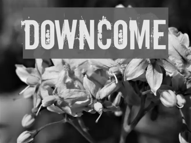
- Proposed Projects: Ideal for posters, album covers, branding for edgy or vintage-themed products, and any design needing a bold, impactful look.
- Category:
- Bold: Yes
- Italic: No
- Weight: Bold
- Width: Normal
- Character Spacing: Normal
- Contrast: Low
- Overall Style: Vintage
- Use Case: Headlines, Logos
- Encoding Scheme:
- Is Fixed Pitch: No
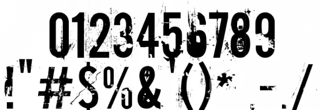
Glyphs ! # $ % ( ) * + , - . / 0 1 2 3 4 5 6 7 8 9 : ; = ? @ A B C D E F G H I J K L M N O P Q R S T U V W X Y Z [ ] ^ _ ` a b c d e f g h i j k l m n o p q r s t u v w x y z { | } ~
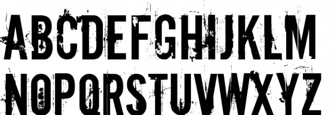
Downcome UPPERCASE

Downcome LOWERCASE
Downcome OTHER CHARS
Gallery Examples
Download Free Fonts
Commercial Fonts Fonts
-
 Buy font Gaspol Remblong Regular Commercial Fonts
 -
 Buy font Aromatron Regular Commercial Fonts
 -
 Buy font Aromatron Ornaments Commercial Fonts