Free Fonts Handwritten
ER Architect KOI-8 Font

Do you have the right license?
Having the right license means that you protect yourself from negative legal consequences of not getting proper permissions. Make sure you have the right license by purchasing the individual font or to use a tool like Envato where all fonts are commercially licensed automatically.
General information
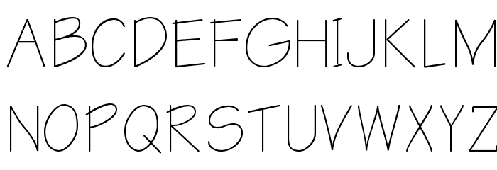
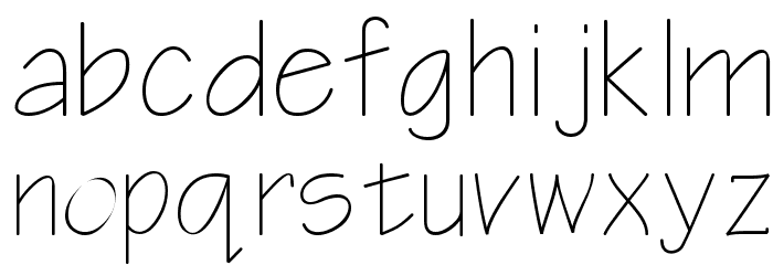
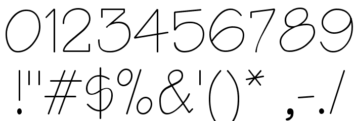
This font features a clean and minimalist design with a handwritten feel. The characters are composed of thin, consistent strokes that give it a light and airy appearance. The uppercase letters are slightly taller than the lowercase, maintaining a uniform width throughout. The numbers and special characters follow the same style, ensuring cohesiveness across all elements. The font's simplicity and elegance make it versatile for various design applications.
A clean, minimalist font with a handwritten style and consistent thin strokes.
- Downloads: 549
- arkoi8n.ttf
- Font: ER Architect KOI-8
- Weight: Regular
- Version: Version 4.0 Thu Mar 07 1995
- No. of Characters:: 226
- Proposed Projects: Ideal for architectural drawings, minimalist branding, personal stationery, and creative projects that require a touch of elegance.
- Category: Handwritten
- Bold: No
- Italic: No
- Weight: Light
- Width: Normal
- Character Spacing: Normal
- Contrast: Low
- Overall Style: Modern
- Use Case: Logos, Headlines, Personal projects
- Encoding Scheme:
- Is Fixed Pitch: No
Glyphs ! # $ % ( ) * + , - . / 0 1 2 3 4 5 6 7 8 9 : ; = ? @ A B C D E F G H I J K L M N O P Q R S T U V W X Y Z [ ] ^ _
UPPERCASE
LOWERCASE
OTHER CHARS
Gallery Examples


Download Free Fonts
-
 Architect Download Architect
 -
Notetaker Download Notetaker


Commercial Fonts Fonts


Fonts Commercial Fonts
-
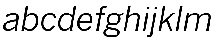
Buy font Benton Sans Wide Book Commercial Fonts
-
Buy font Benton Sans Wide Book Italic Commercial Fonts
-
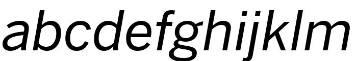
Buy font Benton Sans Wide Bold Commercial Fonts
-
Buy font Benton Sans Wide Bold Italic Commercial Fonts
-
Buy font Benton Sans Wide Black Commercial Fonts
-
Buy font Benton Sans Wide Black Italic Commercial Fonts
-
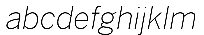
Buy font Benton Sans Thin Commercial Fonts
-
Buy font Benton Sans Thin Italic Commercial Fonts
-
Buy font Benton Sans Regular Commercial Fonts
-
Buy font Benton Sans Medium Commercial Fonts
-
Buy font Benton Sans Medium Italic Commercial Fonts
-
Buy font Benton Sans Light Commercial Fonts
-
Buy font Benton Sans Italic Commercial Fonts
-
Buy font Benton Sans Extra Light Commercial Fonts
-
Buy font Benton Sans Extra Light Italic Commercial Fonts
-
Buy font Benton Sans Extra Compressed Thin Commercial Fonts
-
Buy font Benton Sans Extra Compressed Thin Italic Commercial Fonts
-
Buy font Benton Sans Extra Compressed Regular Commercial Fonts