Eat More Chocolate Font
Eat More Chocolate Description
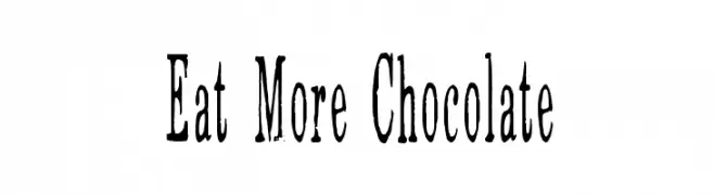
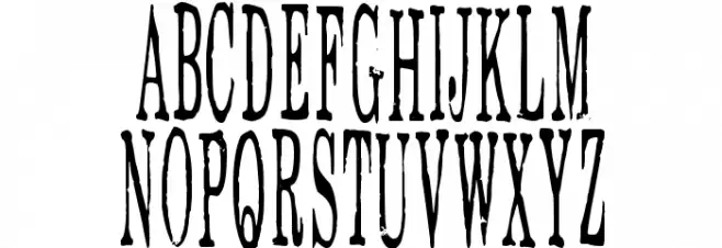
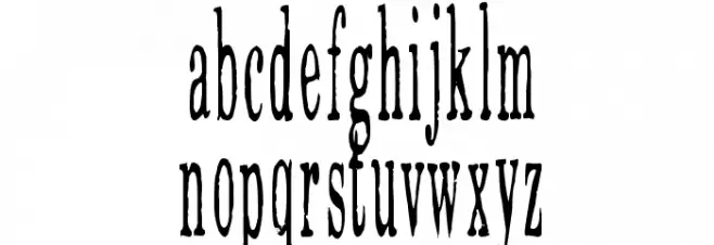
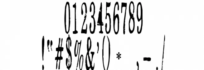
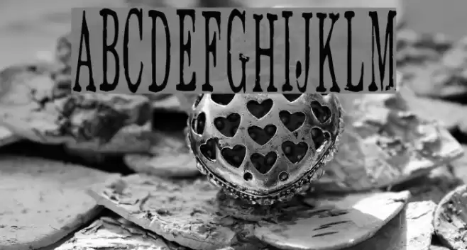
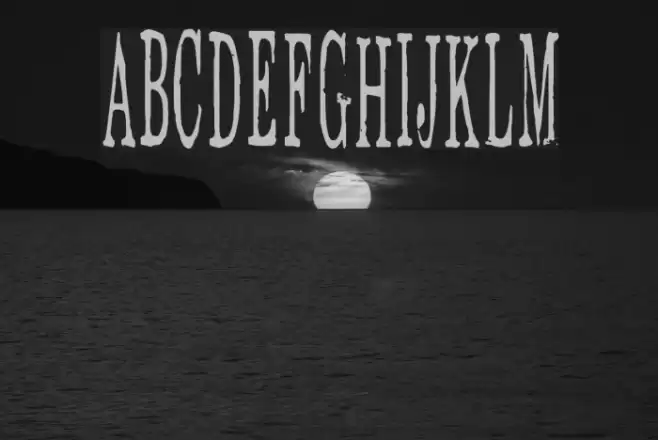
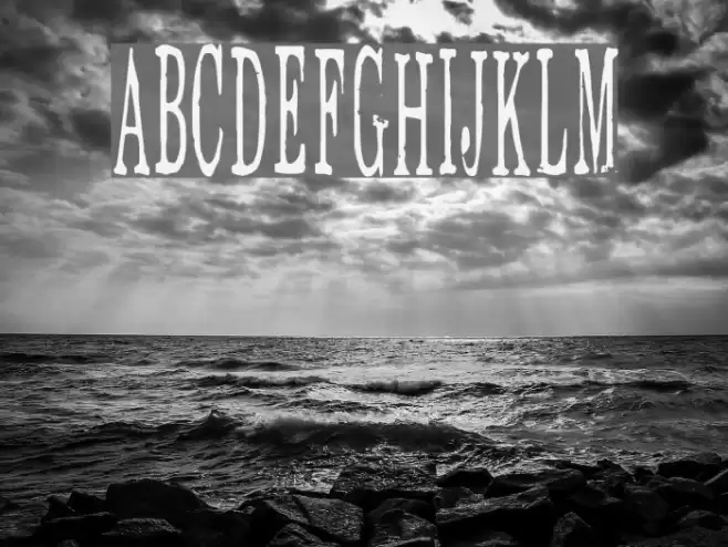
This font features a distressed, vintage style with a bold and impactful presence. The uppercase letters are tall and narrow, with a slightly uneven texture that gives a hand-crafted feel. The lowercase letters maintain this rugged aesthetic, offering a consistent look across both cases. Numbers and special characters follow the same design, ensuring uniformity. The font's unique character is enhanced by its rough edges and irregularities, making it ideal for projects that require a rustic or antique touch.
A distressed, vintage-style font with bold, narrow characters and a hand-crafted feel from Distorted Eroded fonts.
- Downloads: 392
- Eat-More-Chocolate.ttf
- Font: Eat More Chocolate
- Weight: Regular
- Version: Version Version 1.00 April 24, 2007, initial release
- No. of Characters:: 653
- Proposed Projects: Ideal for vintage-themed posters, rustic branding, antique product packaging, and creative design projects that require a touch of nostalgia.
- Category:
- Bold: Yes
- Italic: No
- Weight: Bold
- Width: Condensed
- Character Spacing: Normal
- Contrast: Medium
- Overall Style: Vintage
- Use Case: Headlines, Logos, Posters
- Encoding Scheme:
- Is Fixed Pitch: No
Glyphs ! # $ % ( ) * + , - . / 0 1 2 3 4 5 6 7 8 9 : ; = ? @ A B C D E F G H I J K L M N O P Q R S T U V W X Y Z [ ] ^ _
Eat More Chocolate UPPERCASE
Eat More Chocolate LOWERCASE
Eat More Chocolate OTHER CHARS
Gallery Examples
Download Free Fonts
Commercial Fonts Fonts
-
 Buy font Eat More Fruit JNL Commercial Fonts
 -
 Buy font Good Eatin Pro AOE Commercial Fonts
 -
 Buy font Good Eatin AOE Commercial Fonts