Eat at Joe's St Font

Eat at Joe's St Description
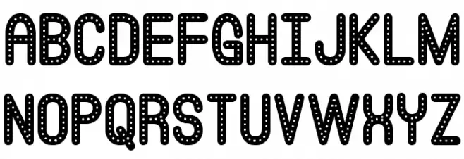
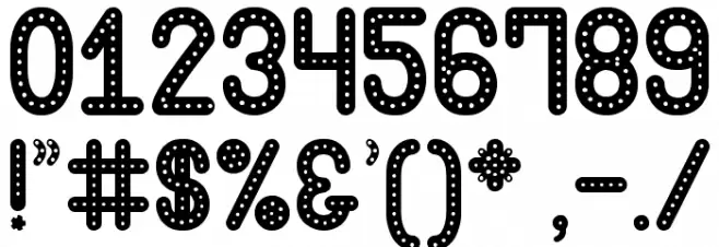
This font features a playful and decorative style with a unique dotted pattern along the edges of each character. The letters are bold and rounded, giving them a friendly and approachable appearance. The consistent use of dots creates a sense of rhythm and movement, making it ideal for eye-catching designs. The font includes both uppercase and lowercase letters, numbers, and a variety of special characters, ensuring versatility in its application. Its distinct style is reminiscent of marquee lights or retro signage, adding a touch of nostalgia and charm to any project.
A playful, dotted decorative font with a retro, marquee light style from Uncategorized fonts.
- Downloads: 356
- Eat at Joes's St.ttf
- Font: Eat at Joe's St
- Weight: Regular
- Version: Version Version 1.00 February 7, 2017, Free for personal use | southype.com
- No. of Characters:: 239
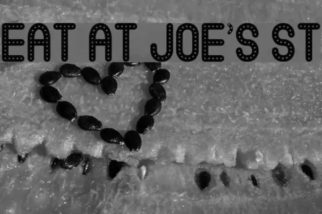
- Proposed Projects: Ideal for vintage-themed posters, playful branding, eye-catching headlines, and retro signage.
- Category:
- Bold: Yes
- Italic: No
- Weight: Bold
- Width: Normal
- Character Spacing: Normal
- Contrast: Low
- Overall Style: Vintage
- Use Case: Headlines, Logos, Posters
- Encoding Scheme:
- Is Fixed Pitch: No
Glyphs ! # $ % ( ) * + , - . / 0 1 2 3 4 5 6 7 8 9 : ; = ? @ A B C D E F G H I J K L M N O P Q R S T U V W X Y Z [ ] ^ _ ` a b c d e f g h i j k l m n o p q r s t u v w x y z { | } ~
Eat at Joe's St UPPERCASE
Eat at Joe's St LOWERCASE

Eat at Joe's St OTHER CHARS
Gallery Examples


Download Free Fonts
Commercial Fonts Fonts
-
 Buy font Eat More Fruit JNL Commercial Fonts
 -
 Buy font Good Eatin Pro AOE Commercial Fonts
 -
 Buy font Good Eatin AOE Commercial Fonts