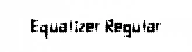
Equalizer Regular Font
Equalizer Regular Description
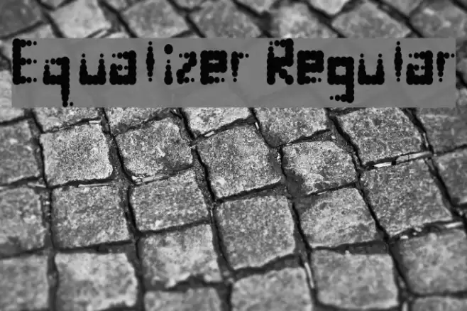
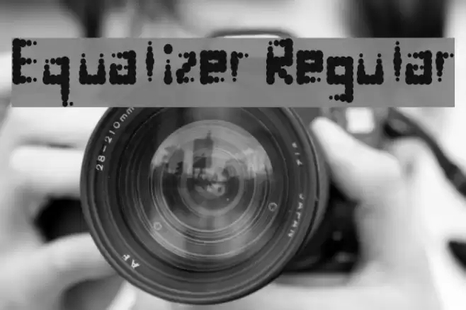
This font features a unique design composed of small, evenly spaced dots forming each character. The style is reminiscent of digital displays or LED screens, giving it a modern and technological feel. The characters are uniformly structured, maintaining a consistent height and width, which enhances readability despite the unconventional dot pattern. The font includes both uppercase and lowercase letters, numbers, and a selection of special characters, all adhering to the dot motif. This design choice makes it particularly eye-catching and suitable for creative projects.
A modern, dot-based font inspired by digital displays from Uncategorized fonts.
- Downloads: 103
- ( Fonts by Geronimo Fonts - Personal-use only. For commercial use please contact owner. FREE )
- equalizer.ttf
- Font: Equalizer Regular
- Weight: Regular
- Version: Version Version 1.0
- No. of Characters:: 76
- Proposed Projects: Ideal for digital-themed designs, tech-related branding, futuristic posters, and creative digital art.
- Category:
- Bold: No
- Italic: No
- Weight: Regular
- Width: Normal
- Character Spacing: Normal
- Contrast: Low
- Overall Style: Modern
- Use Case: Headlines, Logos, Digital Art
- Encoding Scheme:
- Is Fixed Pitch: No
Glyphs ! , . 0 1 2 3 4 5 6 7 8 9 ? A B C D E F G H I J K L M N O P Q R S T U V W X Y Z a b c d e f g h i j k l m n o p q r s t u v w x y z
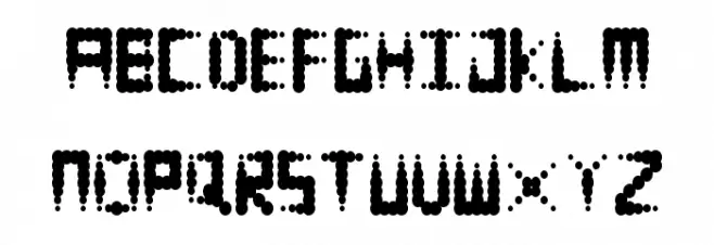
Equalizer Regular UPPERCASE
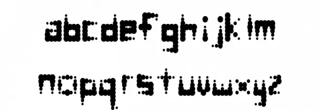
Equalizer Regular LOWERCASE
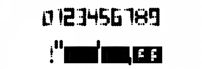
Equalizer Regular OTHER CHARS
Gallery Examples

-
 Buy font Equalizer Bold Commercial Fonts
 -
 Buy font Apollonius Regular Commercial Fonts
 -
 Buy font Dinghybats Regular Commercial Fonts