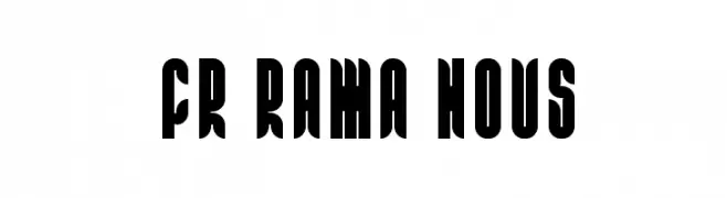
FR Rama Nous Font
FR Rama Nous Description
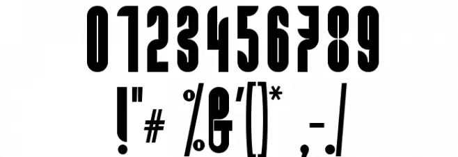
This font features a bold and striking design with a strong geometric influence. The characters are tall and narrow, with a distinct vertical emphasis that creates a powerful visual impact. The strokes are thick and consistent, contributing to a high contrast appearance. The overall look is modern and assertive, making it suitable for attention-grabbing headlines and display purposes. The uppercase and lowercase letters maintain a uniform style, while the numerals and special characters complement the bold aesthetic.
A bold, geometric font with high contrast and a modern style from Uncategorized fonts.
- Downloads: 231
- FR Rama Nous.otf
- Font: FR Rama Nous
- Weight: Regular
- Version: Version 0.001 2009
- No. of Characters:: 323
- Proposed Projects: Ideal for posters, branding, and editorial design where a strong visual statement is needed.
- Category:
- Bold: Yes
- Italic: No
- Weight: Bold
- Width: Condensed
- Character Spacing: Tight
- Contrast: High
- Overall Style: Modern
- Use Case: Headlines, Logos
- Encoding Scheme:
- Is Fixed Pitch: No
Glyphs ! # ( ) * + , - . / 0 1 2 3 4 5 6 7 8 9 : ; = ? @ A B C D E F G H I J K L M N O P Q R S T U V W X Y Z [ ] _ ` a b c d e f g h i j k l m n o p q r s t u v w x y z { | } Ā ā Ă ă Ą ą Ć ć Ĉ ĉ Ċ ċ Č č Ď ď Ē ē Ĕ ĕ Ė ė Ę ę Ě ě Ĝ ĝ Ğ ğ Ġ ġ Ģ ģ Ĥ ĥ Ĩ ĩ ī Ĭ Į į İ IJ ij Ĵ ĵ Ķ ķ Ĺ ĺ Ļ ļ Ľ ľ Ŀ ŀ Ł ł Ń ń Ņ ņ Ň ň Ō ō Ŏ ŏ Ő ő Ŕ ŕ Ŗ ŗ Ř ř Ś ś Ŝ ŝ Ş ş Ţ ţ Ť ť Ũ ũ Ū ū Ŭ ŭ Ů ů Ű ű Ų ų Ŵ ŵ Ŷ ŷ Ź ź Ż ż Ž ž Ǽ ǽ Ǿ ǿ Ș ș ˇ ˘ ˙ ˚ ˛ ˝ Ẁ ẁ Ẃ ẃ Ẅ ẅ Ỳ ỳ ‼
FR Rama Nous UPPERCASE
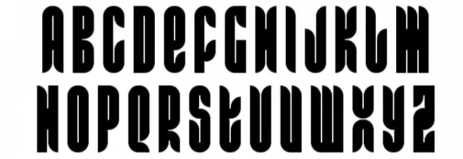
FR Rama Nous LOWERCASE

FR Rama Nous OTHER CHARS
Gallery Examples


Download Free Fonts
Commercial Fonts Fonts
-
 Buy font Chez Nous NF Commercial Fonts
 -
 Buy font Rama Gothic Cond Bold Commercial Fonts
 -
 Buy font Rama Gothic SemiBold Commercial Fonts