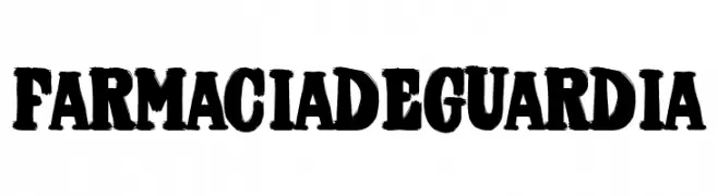
Farmacia de Guardia Font
Farmacia de Guardia Description
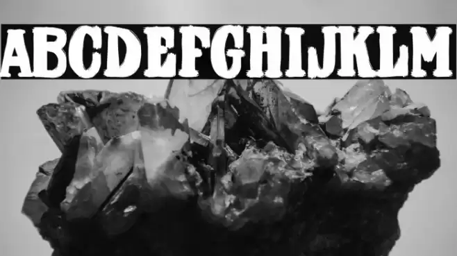
This font features a bold and dynamic style with a distressed, textured appearance that gives it a rugged and vintage feel. The characters are thick and heavy, with irregular edges that create a sense of movement and energy. The uppercase and lowercase letters maintain a consistent weight, contributing to a cohesive look. The numbers and special characters share the same boldness and texture, ensuring uniformity across all elements. This font's unique style makes it stand out, ideal for projects that require a strong visual impact.
A bold, textured font with a rugged, vintage appearance from Uncategorized fonts.
- Downloads: 102
- ( Fonts by Woodcutter FREE )
- Font: Farmacia de Guardia
- Weight:
- Version:
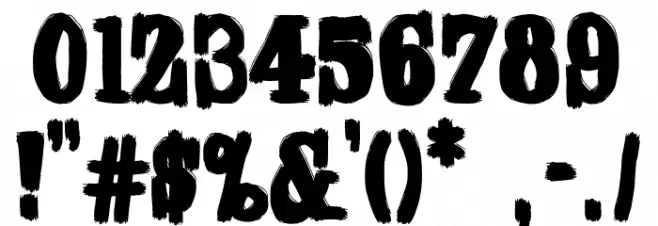
- No. of Characters:: over 20
- Proposed Projects: Ideal for posters, logos, branding, and any design needing a bold, vintage touch.
- Category:
- Bold: Yes
- Italic: No
- Weight: Bold
- Width: Normal
- Character Spacing: Normal
- Contrast: Low
- Overall Style: Vintage
- Use Case: Logos, Posters, Branding
- Encoding Scheme:
- Is Fixed Pitch: No
Glyphs
Farmacia de Guardia UPPERCASE
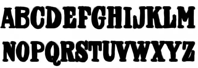
Farmacia de Guardia LOWERCASE

Farmacia de Guardia OTHER CHARS
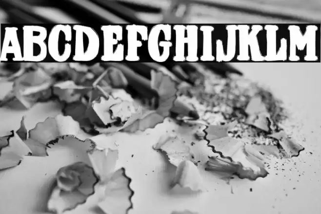
Gallery Examples
Download
102 Downloads
-
 Buy font Guardian Snowing Regular Commercial Fonts
 -
 Buy font Dee Dee Heavy Commercial Fonts
 -
 Buy font Dee Dee Thin Commercial Fonts