Fonts
February2-Normal Font
Description
- February 2 - Normal (Personal use).otf
- Font: February2-Normal
- Weight: Normal
- Version: Version 1.001 personal use
- No. of Characters:: 427
- Encoding Scheme:
- Is Fixed Pitch: 0
Welcome to the Font Trends page — your destination for discovering which fonts are shaping today’s design landscape. Whether you’re working on a brand refresh, social media visuals, or website UI, following current font trends helps your work feel fresh and relevant.
This collection features the most trending fonts of the season, chosen by designers and creators across the world. Expect to see elegant serifs, minimalist sans serifs, expressive display fonts, and handcrafted scripts that define modern aesthetics in 2025.
Combine your favorite trending typefaces with timeless categories like Modern, Serif, or Handwritten for a balanced and eye-catching design.
-
( Fonts by Uddi Uddi )
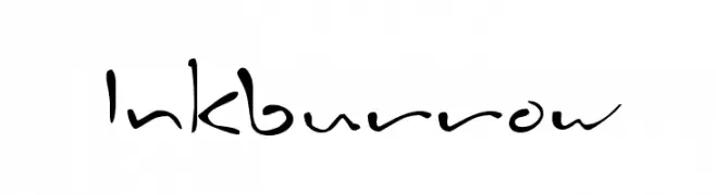
A lively, handwritten font with playful, free-flowing strokes.
 Download 4186 Downloads@WebFont
 -
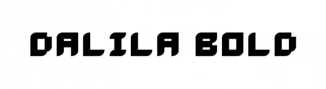
![Dalila Bold Free Fonts Download]() Download 285 Downloads@WebFont
Download 285 Downloads@WebFont -
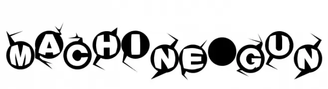
![Machine-gun Free Fonts Download]() Download 766 Downloads@WebFont
Download 766 Downloads@WebFont -
![Circos Free Fonts Download]() Download 757 Downloads@WebFont
Download 757 Downloads@WebFont -
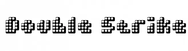
![Double Strike Free Fonts Download]() Download 644 Downloads@WebFont
Download 644 Downloads@WebFont -
![Babylon Centaur Free Fonts Download]() Download 1904 Downloads@WebFont
Download 1904 Downloads@WebFont -
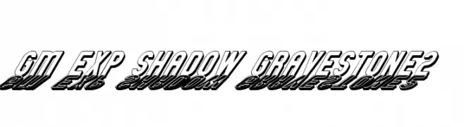
![GM Exp Shadow Gravestone2 Free Fonts Download]() Download 490 Downloads@WebFont
Download 490 Downloads@WebFont -
![Wishmaster Credits DEMO Free Fonts Download]() Download 306 Downloads@WebFont
Download 306 Downloads@WebFont


FAQ — Font Trends
What are the current font trends?
Simplicity, legibility, and warmth dominate: rounded sans serifs, high-contrast serifs, and tasteful retro revivals are everywhere — clean but human.
Which fonts are trending in design right now?
Popular choices include Inkburrow, Dalila Bold, Machine-gun, Circos and Double Strike — fonts known for their balance between modern and timeless. They look great on web pages, social content, and packaging, bringing a clean yet expressive feel.
How do I use trending fonts in my projects?
Use one standout display font for titles and pair it with a simple sans serif for body text. This creates contrast without losing readability. Always test how your chosen font trend performs across screen sizes and branding materials before finalizing.
💡 Tip: Refresh key assets every few months with a new trending font to keep visuals sharp and discoverable.