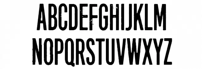
Forty-six Font

Forty-six Description
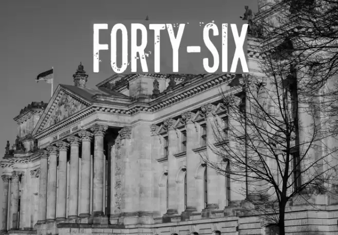
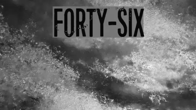
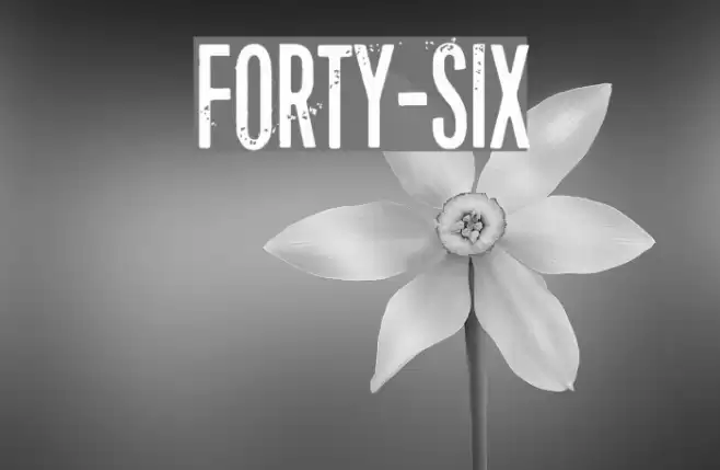
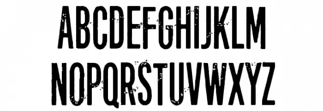
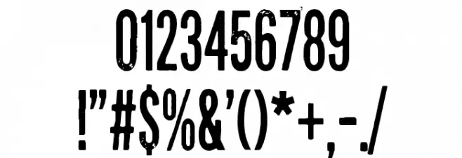
This font features a bold, distressed style with a vintage, grunge aesthetic. The characters are tall and narrow, with a slightly uneven texture that gives them a worn, rugged appearance. The uppercase letters are prominent, while the lowercase letters maintain the same distressed look. Numbers and special characters are consistent with this style, making the font suitable for designs that require a strong, impactful presence. The overall look is both bold and artistic, perfect for projects that aim to capture an edgy or retro vibe.
A bold, distressed font with a vintage, grunge aesthetic from Distorted Eroded fonts.
- Downloads: 2,081
- ( Fonts by junkohanhero FREE )
- Forty-six.ttf
- Font: Forty-six
- Weight: Regular
- Version: Version Version 1.00 September 21, 2015, initial release
- No. of Characters:: 653
- Proposed Projects: Ideal for posters, album covers, branding, and any design needing a bold, vintage look.
- Category:
- Bold: Yes
- Italic: No
- Weight: Bold
- Width: Condensed
- Character Spacing: Normal
- Contrast: Low
- Overall Style: Vintage
- Use Case: Headlines, Logos, Posters
- Encoding Scheme:
- Is Fixed Pitch: No
Glyphs ! # $ % ( ) * + , - . / 0 1 2 3 4 5 6 7 8 9 : ; = ? @ A B C D E F G H I J K L M N O P Q R S T U V W X Y Z [ ] ^ _ ` a b c d e f g h i j k l m n o p q r s t u v w x y z { | } ~
Forty-six UPPERCASE
Forty-six LOWERCASE
Forty-six OTHER CHARS
Gallery Examples