Free Fonts Sans-Serif
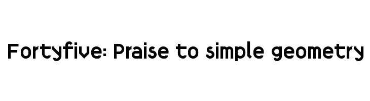
Fortyfive: Praise to simple geometry Font
Do you have the right license?
Having the right license means that you protect yourself from negative legal consequences of not getting proper permissions. Make sure you have the right license by purchasing the individual font or to use a tool like Envato where all fonts are commercially licensed automatically.
General information
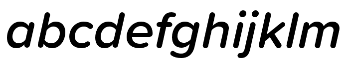
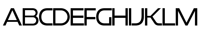
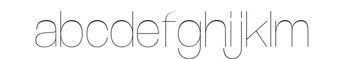
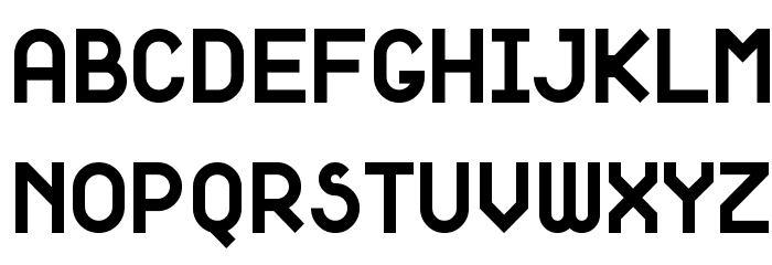
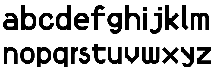
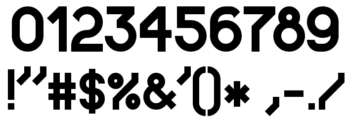
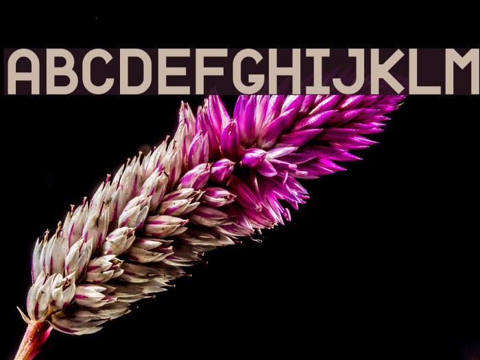
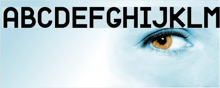
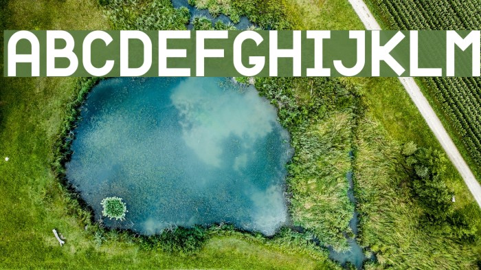
This font features a bold and geometric design, characterized by clean lines and a modern aesthetic. The uppercase letters are uniform in height, with a consistent stroke width that gives a strong and stable appearance. The lowercase letters maintain the geometric theme, with rounded edges that add a touch of softness to the overall look. The numerals are clear and easy to read, making them suitable for various applications. Special characters are well-integrated, maintaining the font's cohesive style. This font's simplicity and clarity make it versatile for a range of design projects.
A bold, geometric font with clean lines and a modern aesthetic.
- Downloads: 1,154
- Fortyfive-Praise-to-simple-geometry.ttf
- Font: Fortyfive: Praise to simple geometry
- Weight: Bold
- Version: Version Version 1.0
- No. of Characters:: 270
- Proposed Projects: Ideal for branding, headlines, posters, and digital interfaces where clarity and modernity are key.
- Category: Sans-Serif
- Bold: Yes
- Italic: No
- Weight: Bold
- Width: Normal
- Character Spacing: Normal
- Contrast: Low
- Overall Style: Modern
- Use Case: Headlines, Logos, Posters
- Encoding Scheme:
- Is Fixed Pitch: No
Glyphs ! # $ % ( ) * + , - . / 0 1 2 3 4 5 6 7 8 9 : ; = ? @ A
UPPERCASE
LOWERCASE
OTHER CHARS
Gallery Examples
Download Free Fonts
-
 TPF Janus Download TPF Janus
 -
Better Sans Regular Download Better Sans Regular


Commercial Fonts Fonts


Fonts Commercial Fonts
-
Buy font Proxima Soft Semibold Italic Commercial Fonts
-
Buy font Proxima Soft Light Italic Commercial Fonts
-
Buy font Proxima Soft Extra Condensed Extrabold Italic Commercial Fonts
-
Buy font Proxima Soft Extra Condensed Black Italic Commercial Fonts
-
Buy font Proxima Soft Condensed Medium Italic Commercial Fonts
-
Buy font Proxima Soft Condensed Bold Italic Commercial Fonts
-
Buy font Titillium Web Italic Commercial Fonts
-
Buy font Restore Book Commercial Fonts
-
Buy font Restore Bold Commercial Fonts
-
Buy font Restore Black Commercial Fonts
-
Buy font Coolvetica UltraLight Commercial Fonts
-
Buy font Coolvetica Regular Commercial Fonts
-
Buy font Coolvetica Regular Italic Commercial Fonts
-
Buy font Caprizant Bold Commercial Fonts
-
Buy font Beloved Script Bold Commercial Fonts
-
Buy font Questa Slab Bold Commercial Fonts
-
Buy font Questa Slab Bold Italic Commercial Fonts
-
Buy font Questa Slab Black Commercial Fonts