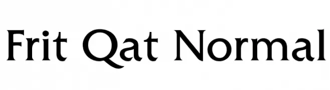
Frit Qat Normal Font
Frit Qat Normal Description
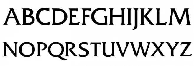
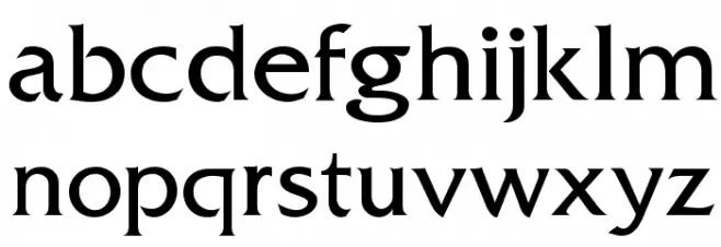
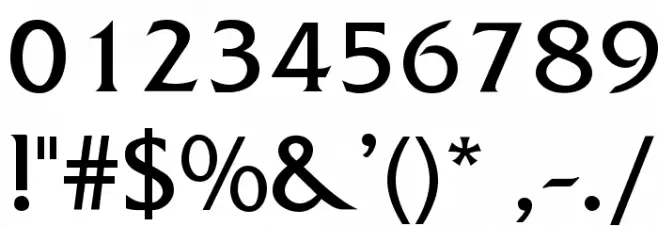
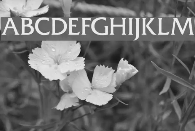
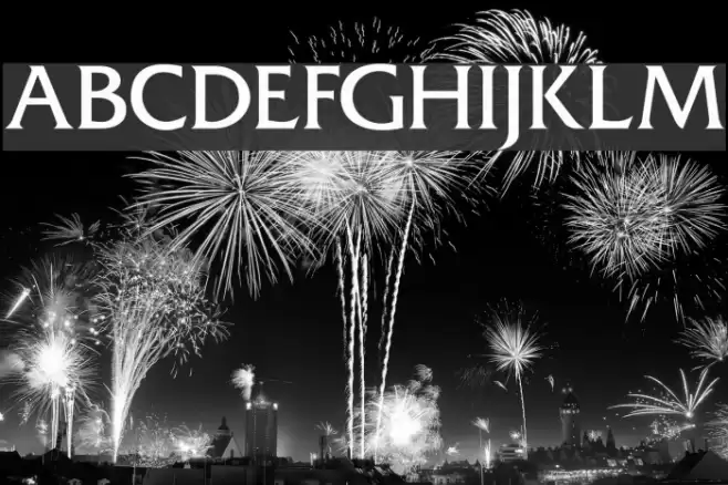
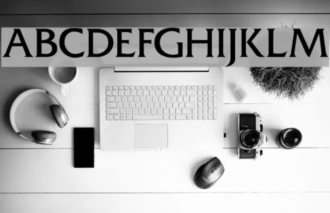
This font features a classic serif style with elegant and sharp serifs that provide a sophisticated appearance. The uppercase letters are bold and commanding, while the lowercase letters maintain a consistent and harmonious flow. The numerals are clear and distinct, making them easily readable. Special characters are well-designed, complementing the overall aesthetic. The font's balance between thick and thin strokes gives it a medium contrast, enhancing its readability and visual appeal. Its timeless design makes it suitable for a variety of applications.
A classic serif font with elegant serifs and medium contrast strokes from Formal fonts.
- Downloads: 2,763
- fritqat.ttf
- Font: Frit Qat Normal
- Weight: Normal
- Version: Version 1.000
- No. of Characters:: 200
- Proposed Projects: Ideal for editorial design, book covers, formal invitations, and branding projects.
- Category:
- Bold: No
- Italic: No
- Weight: Regular
- Width: Normal
- Character Spacing: Normal
- Contrast: Medium
- Overall Style: Classic
- Use Case: Headlines, Body text, Logos
- Encoding Scheme:
- Is Fixed Pitch: No
Glyphs ! # $ % ( ) * + , - . / 0 1 2 3 4 5 6 7 8 9 : ; = ? @ A B C D E F G H I J K L M N O P Q R S T U V W X Y Z [ ] ^ _
Frit Qat Normal UPPERCASE
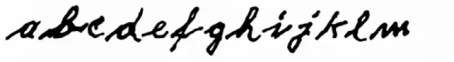
Frit Qat Normal LOWERCASE
Frit Qat Normal OTHER CHARS
Gallery Examples
Download Free Fonts
Commercial Fonts Fonts
-
 Buy font DF Pommes Frites Italic Commercial Fonts
 -
 Buy font DF Pommes Frites Commercial Fonts
 -
 Buy font Fritz Dittert EF Commercial Fonts